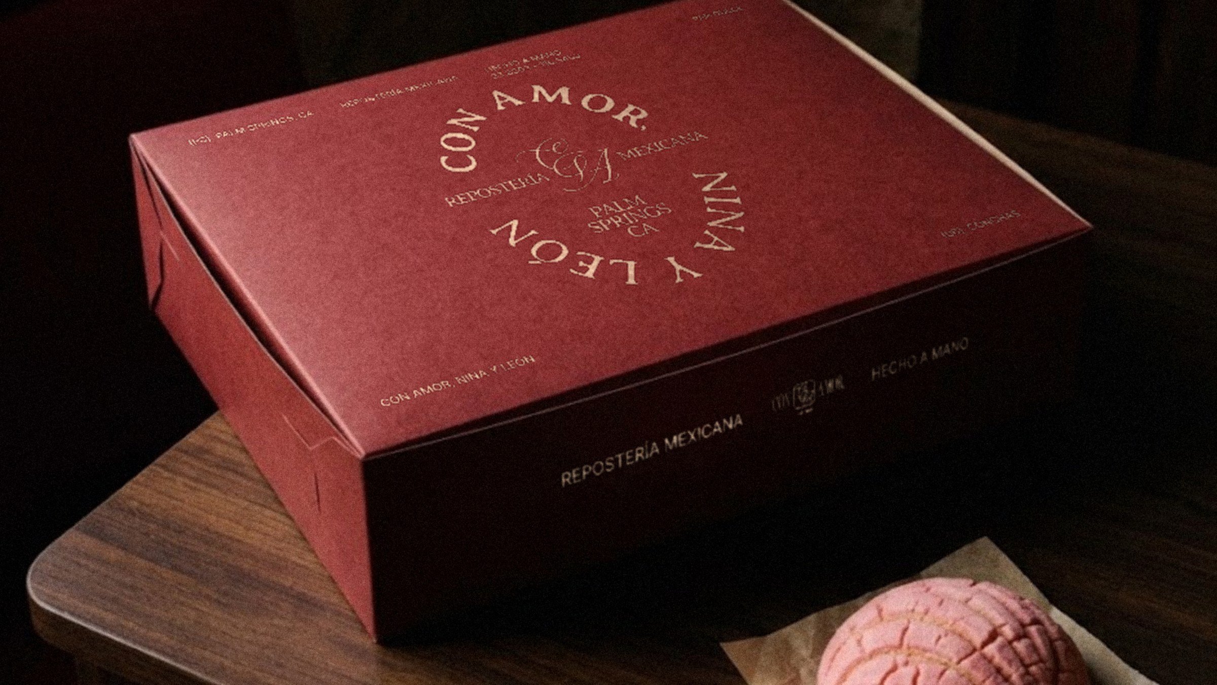
Con Amor, Nina y León
Logo Design · Brand Vision · Web Concept · Art Direction
Logo Design
Brand Vision
Packaging + Web Concept
Art Direction
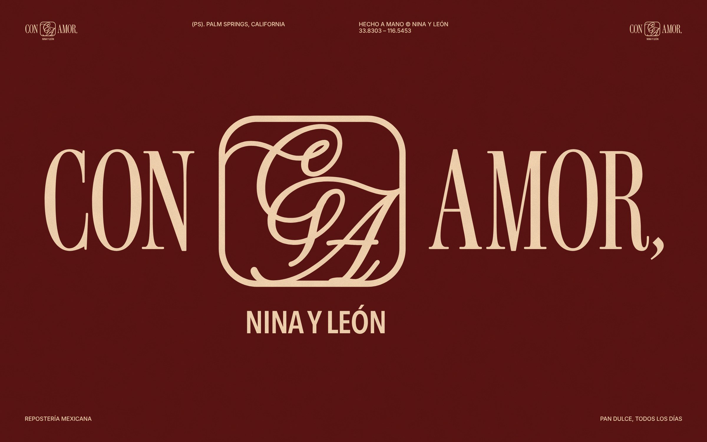
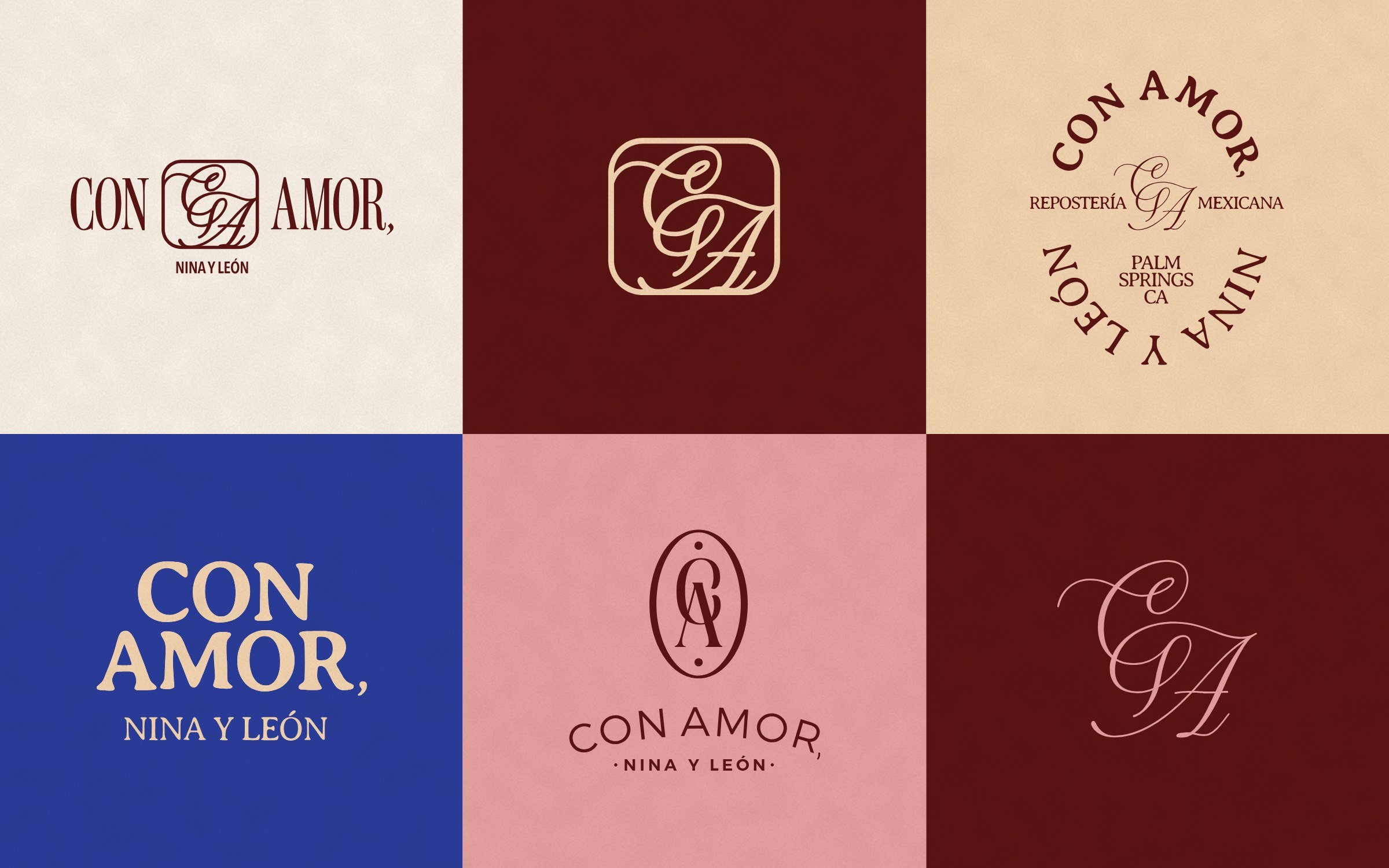
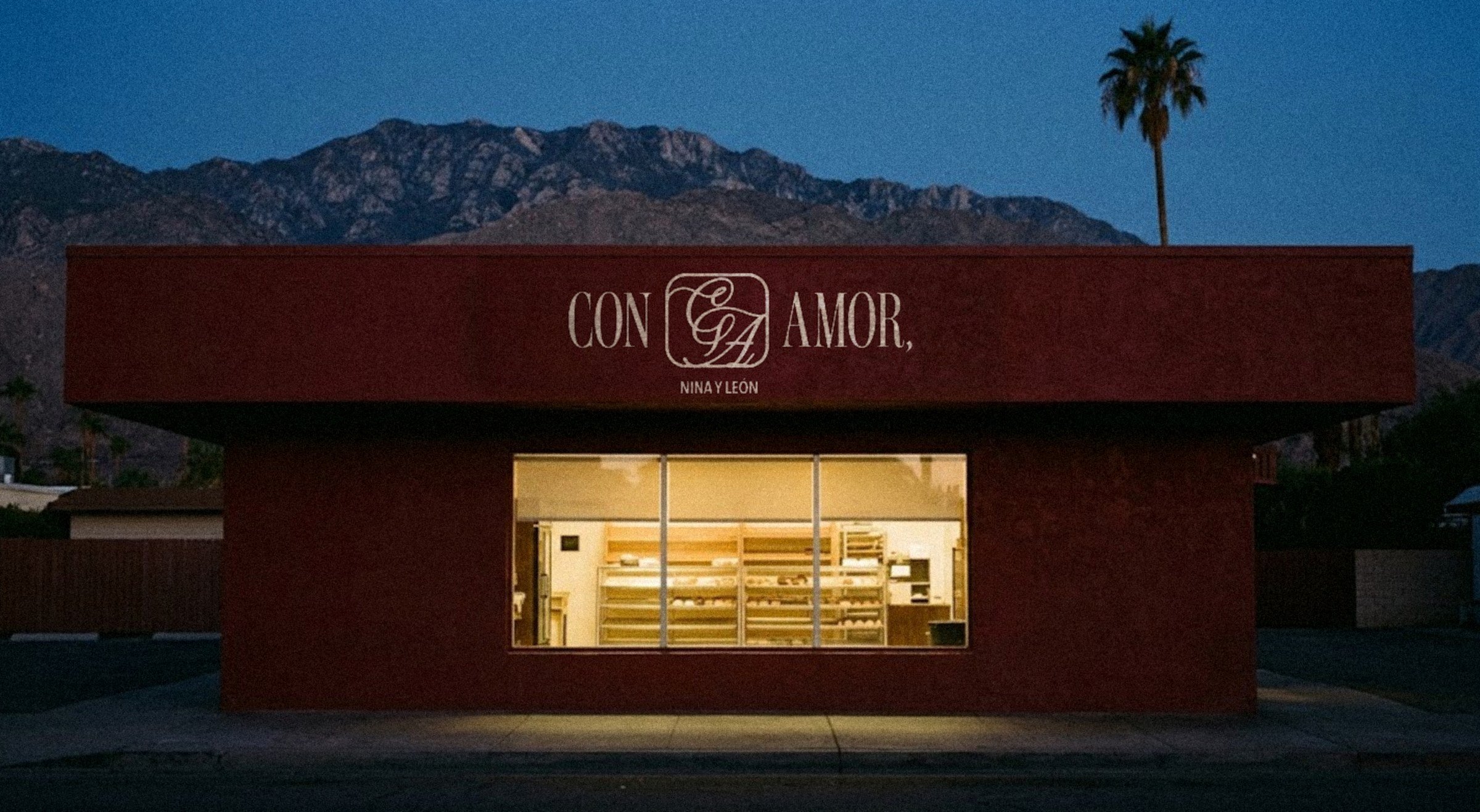
Con Amor, Nina y León is a Mexican bakery (repostería mexicana) in Palm Springs, California, and they came to me for a logo: a script CA monogram set inside a condensed CON AMOR wordmark.
The mark was the brief, but a bakery that signs every box deserves a whole world. This case study shows what that world could be: the brand system, packaging, menu, website, UI/UX, and social content I built out from a single mark, with photography I art directed to match.
Brand Evolution
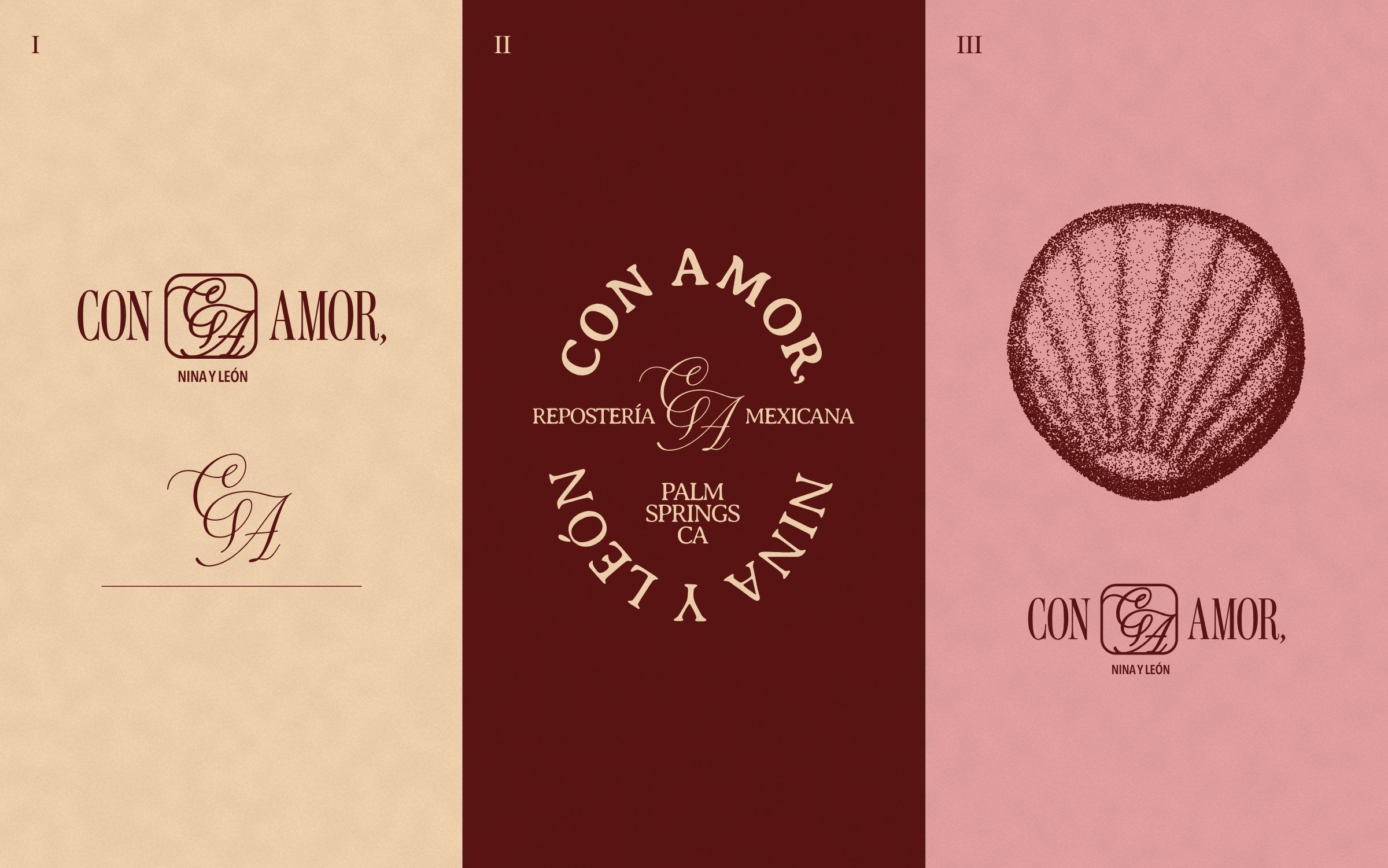
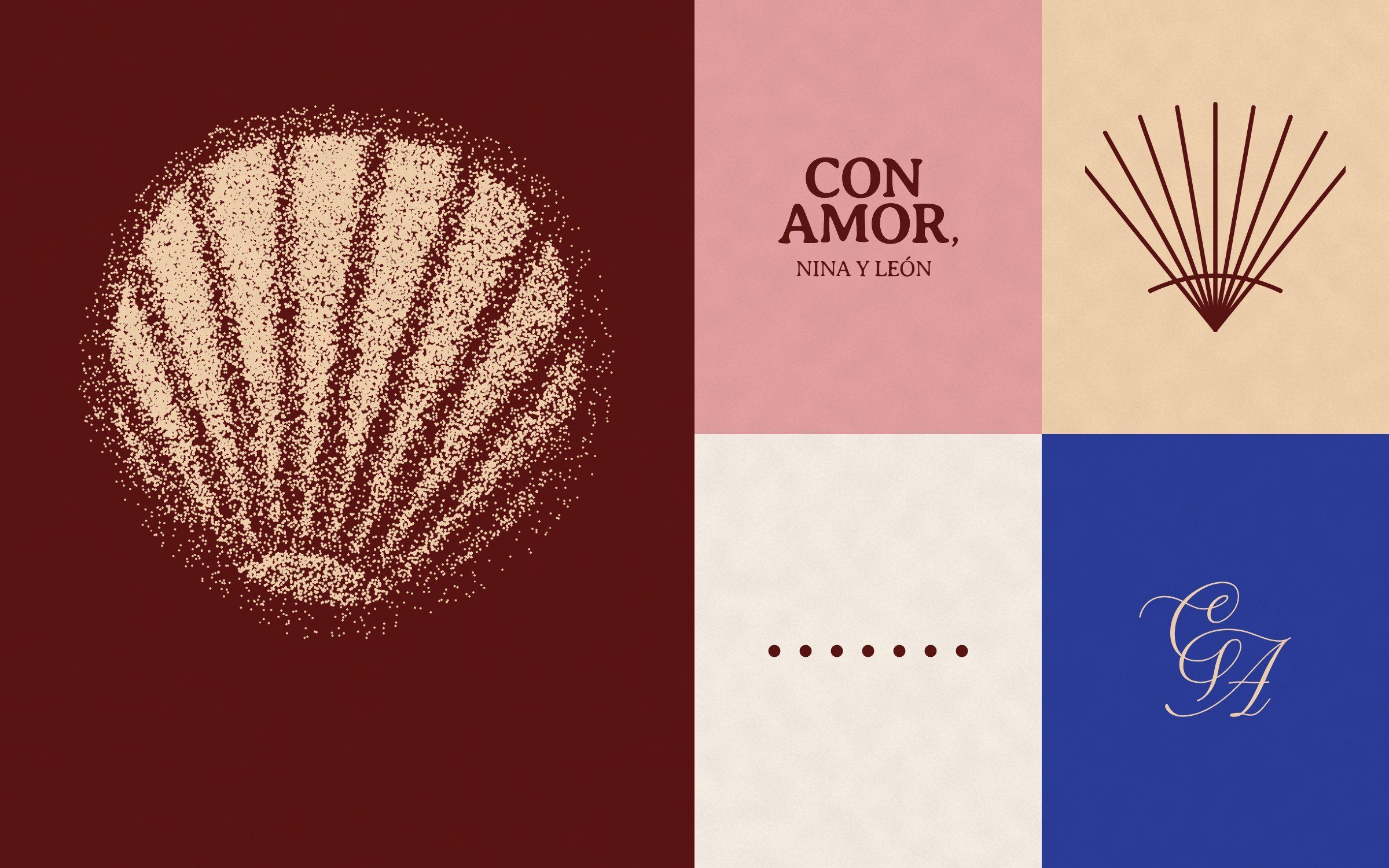
The commission was the mark: a script CA monogram set inside the condensed CON AMOR wordmark. I built everything else around the idea of a letter, signed at the bottom, and explored three directions for how the mark could carry it: a signature lockup, a round seal, and a stippled concha engraving.
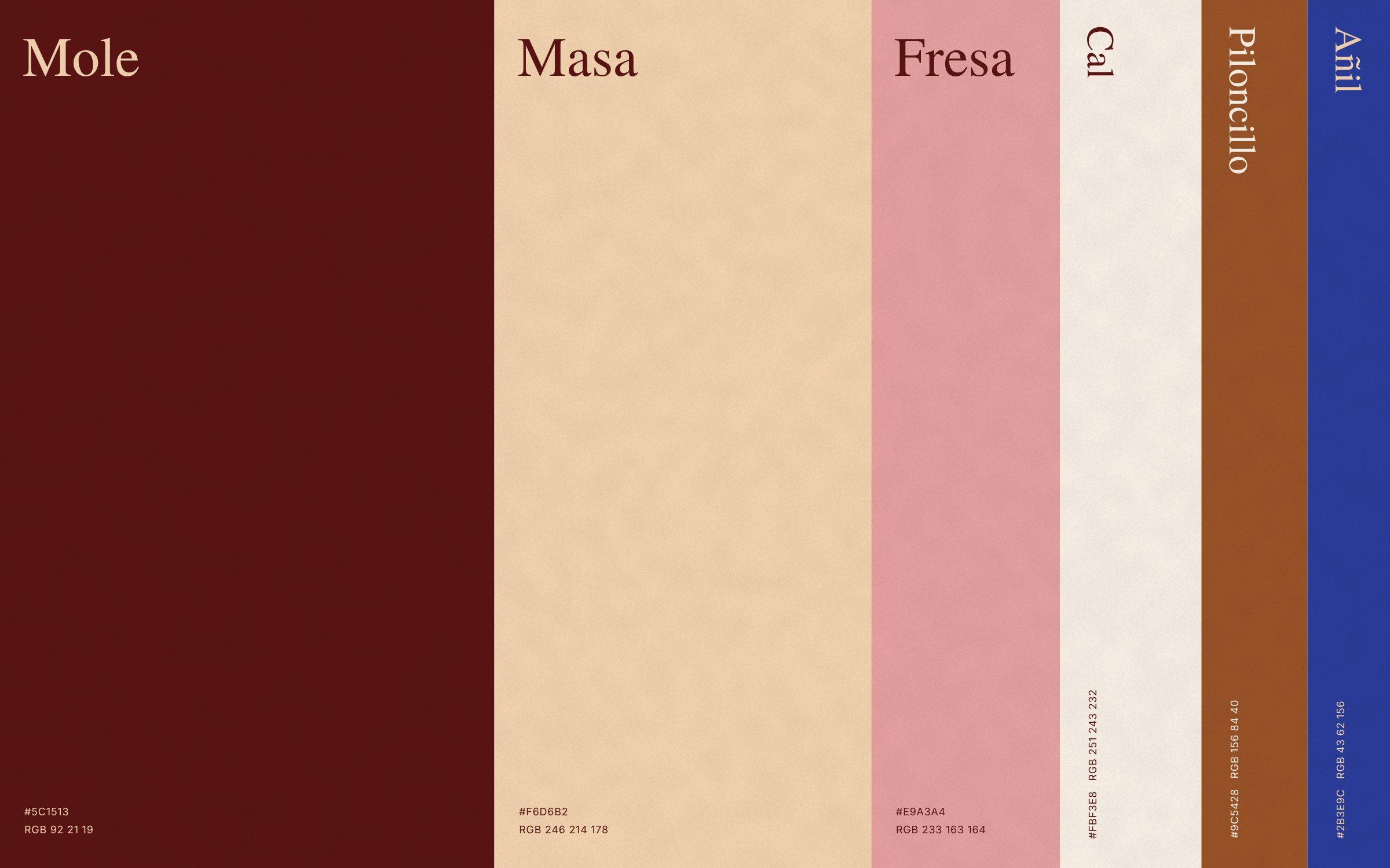
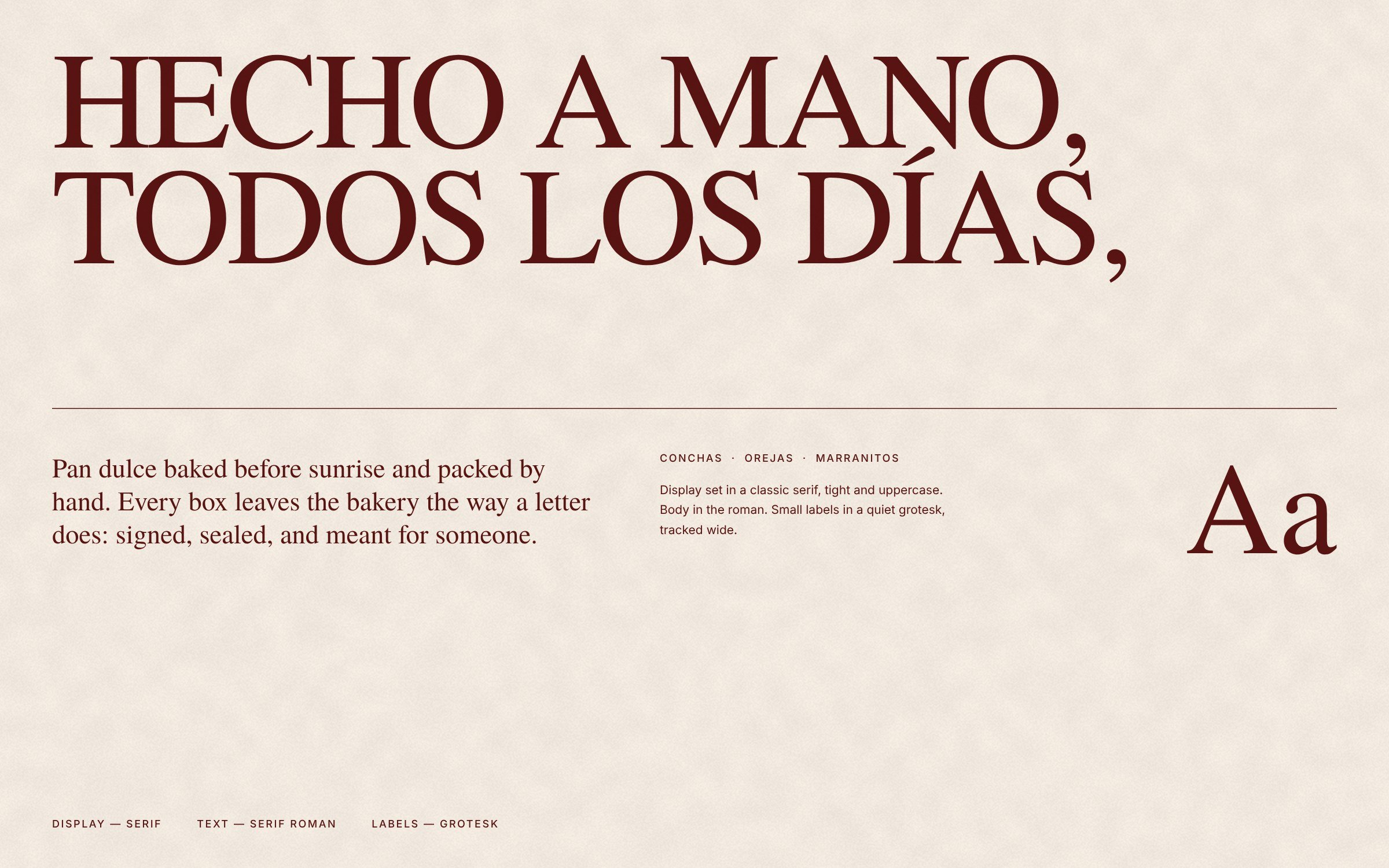
The palette borrows from the pan dulce case itself (mole, masa, fresa, and cal) with a small hit of añil blue. A classic serif runs oversized and cropped, so the brand stays recognizable even when the logo is off the page.
Brand Collateral
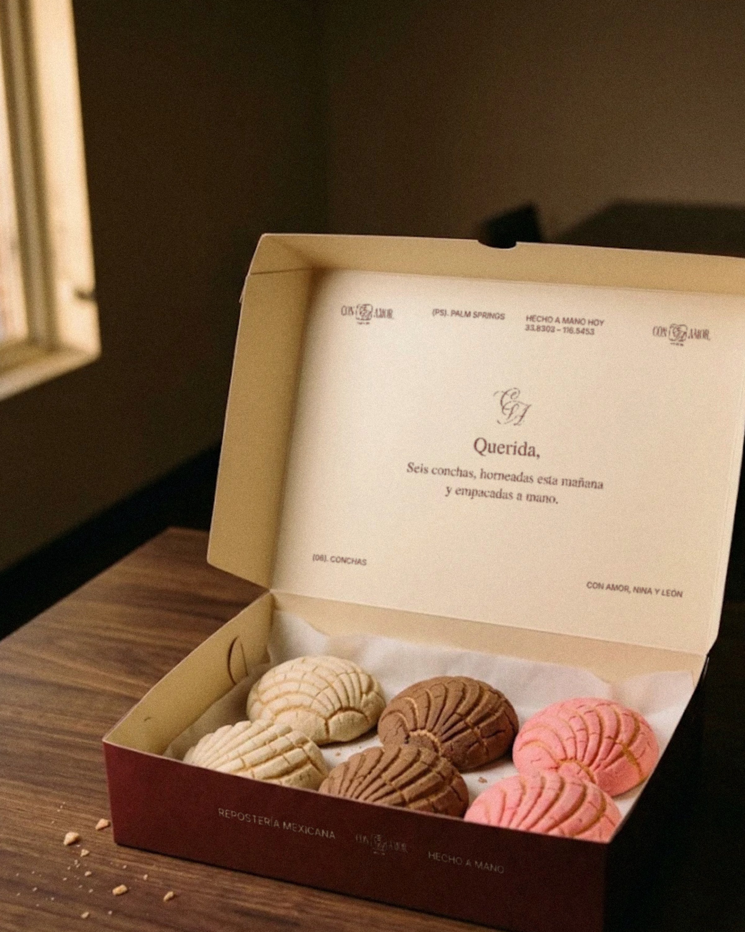
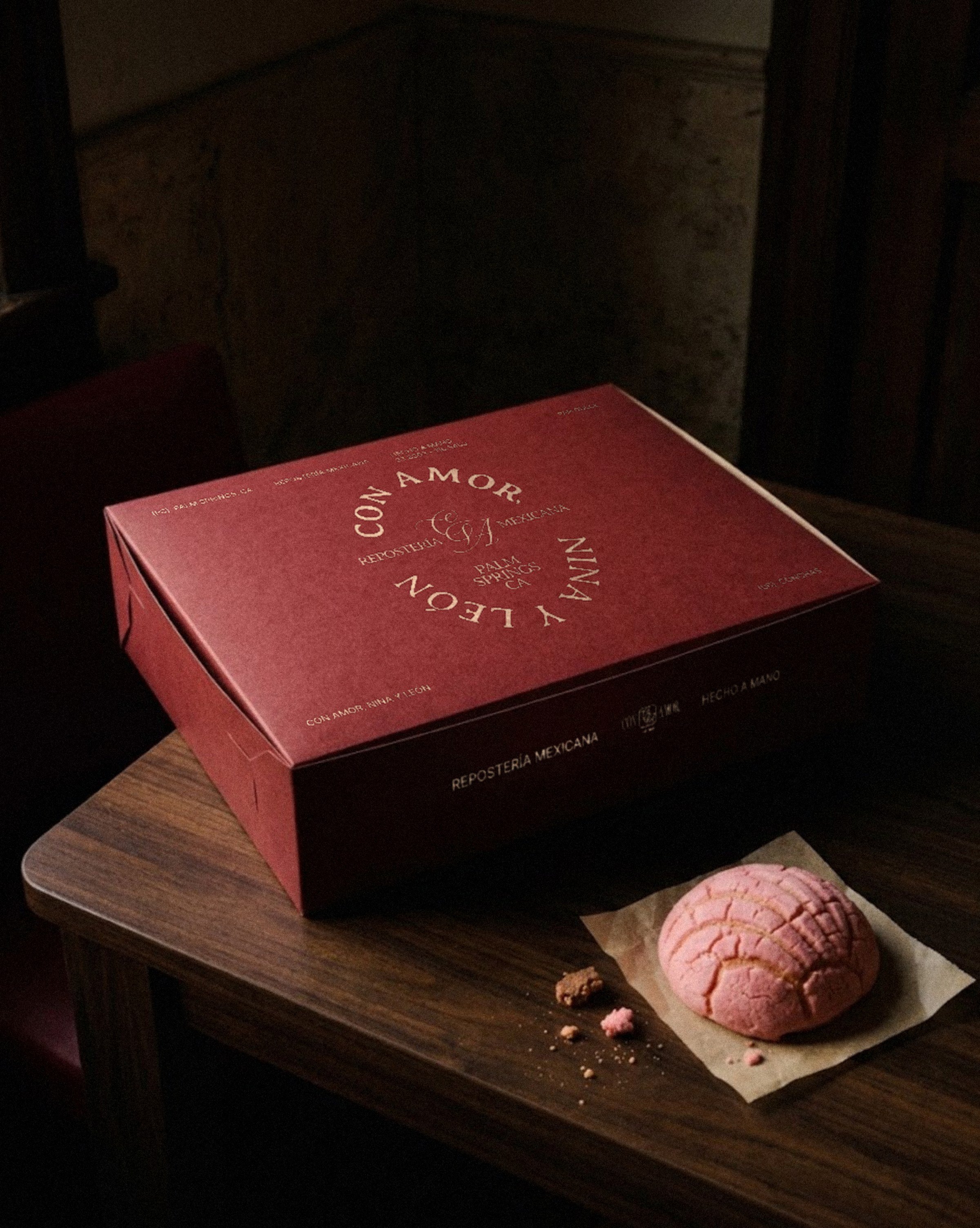
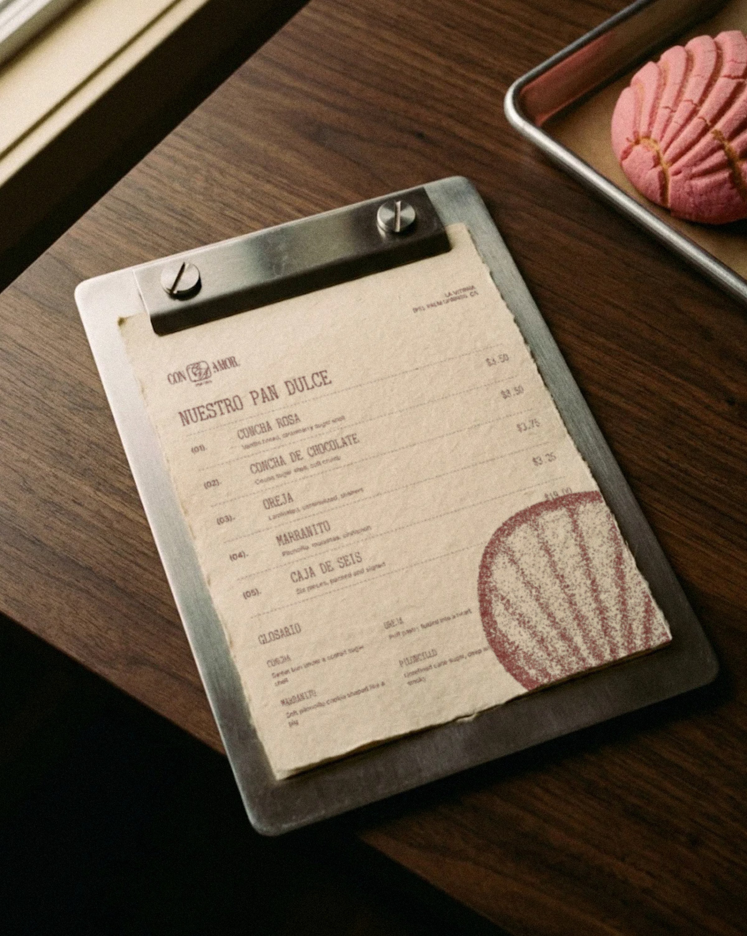
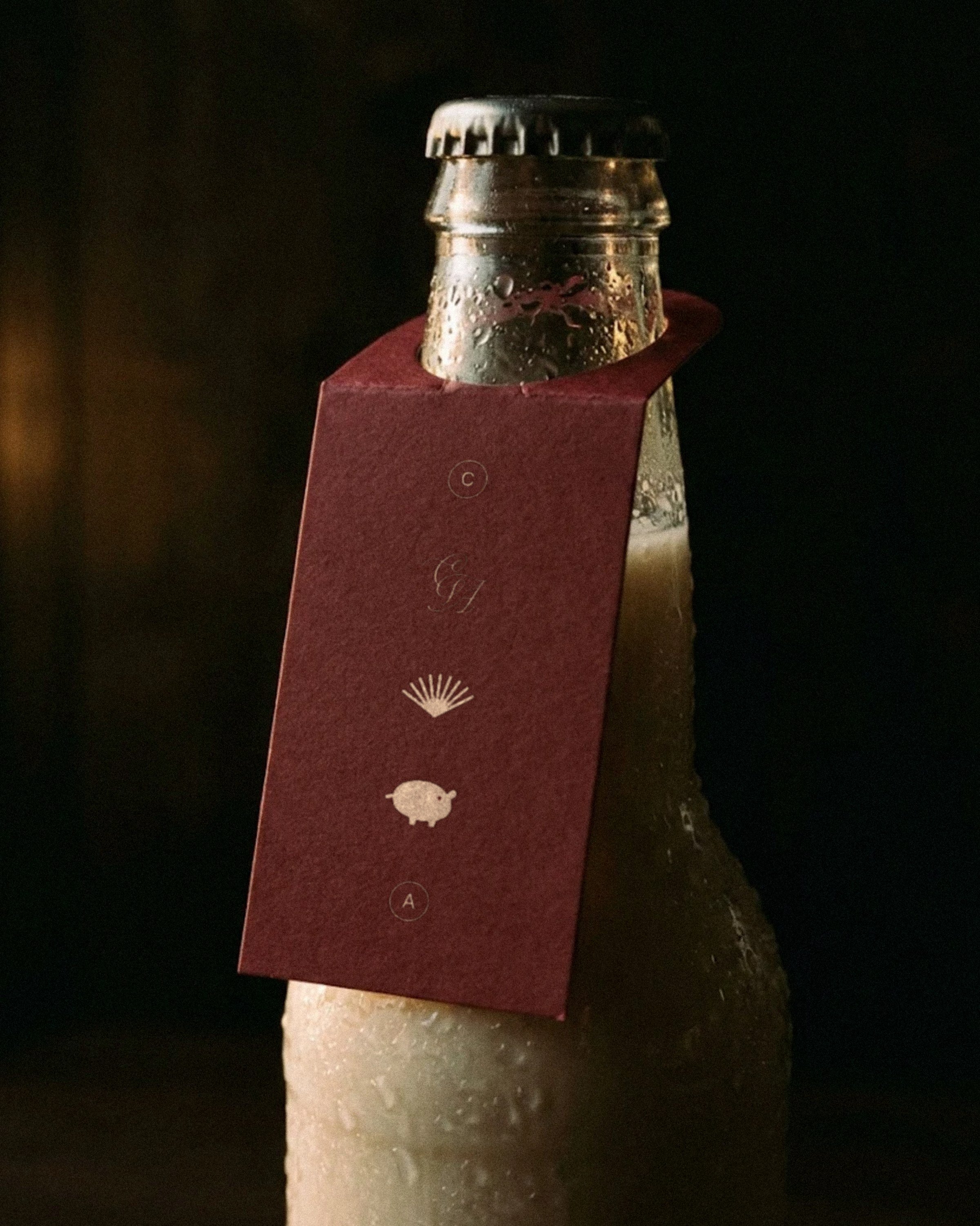
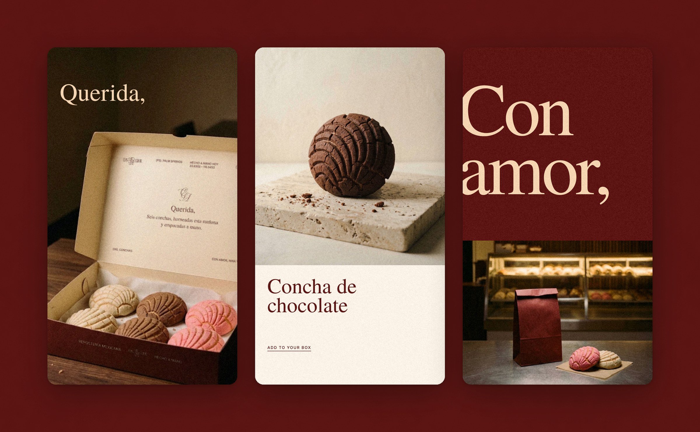
None of this was in the brief. I designed it to show what a logo becomes once it has a system to live in. The oxblood box carries the round CA seal on its lid and opens to a cream interior, where a quiet note sits inside the lid, framed by the wordmark and Palm Springs coordinates. The menu borrows from old diner cards: numbered pieces, dashed rules, and a short glosario of pan dulce terms. A horchata neck tag stacks the brand’s small symbols, from the CA monogram to a concha fan and a marranito.
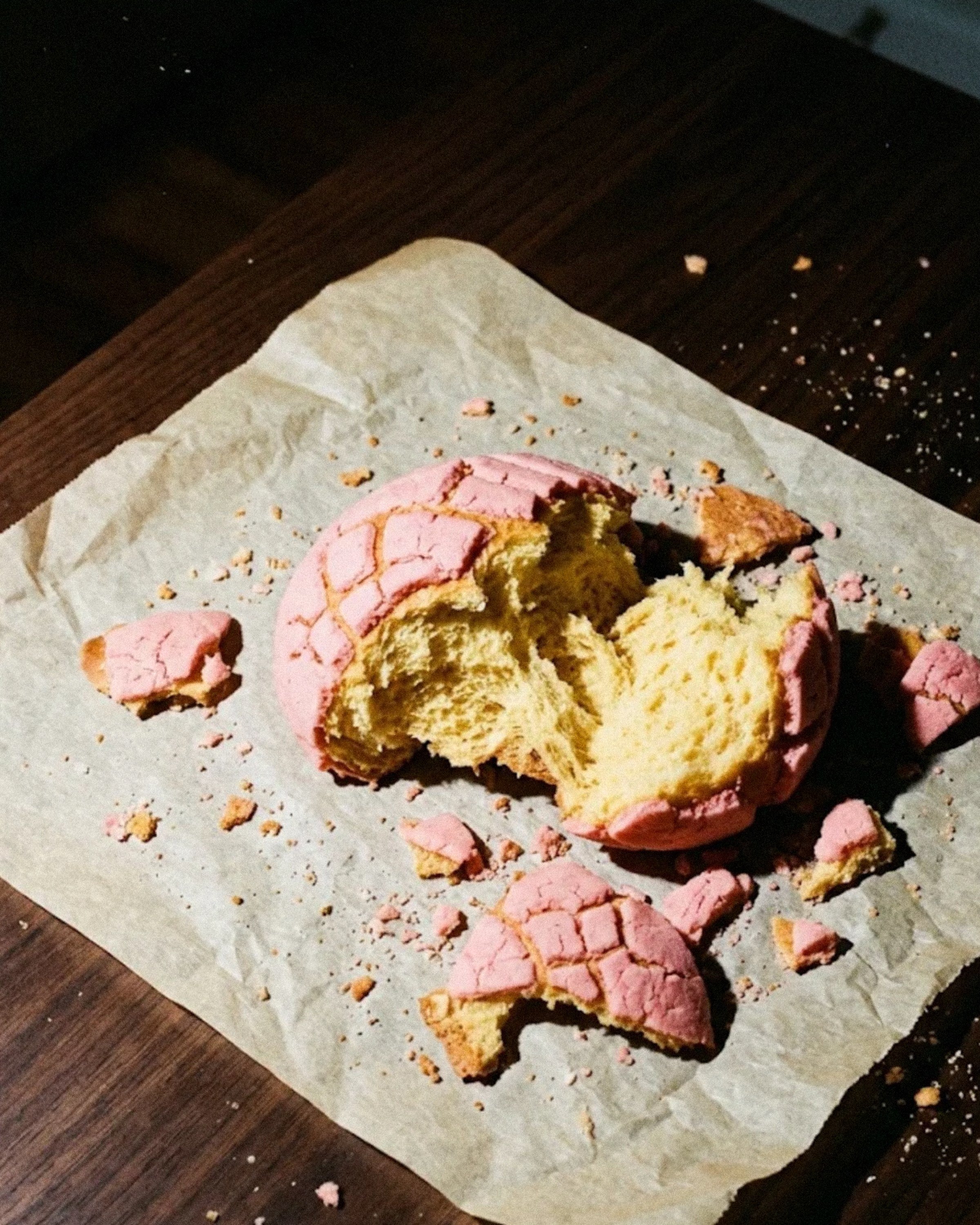
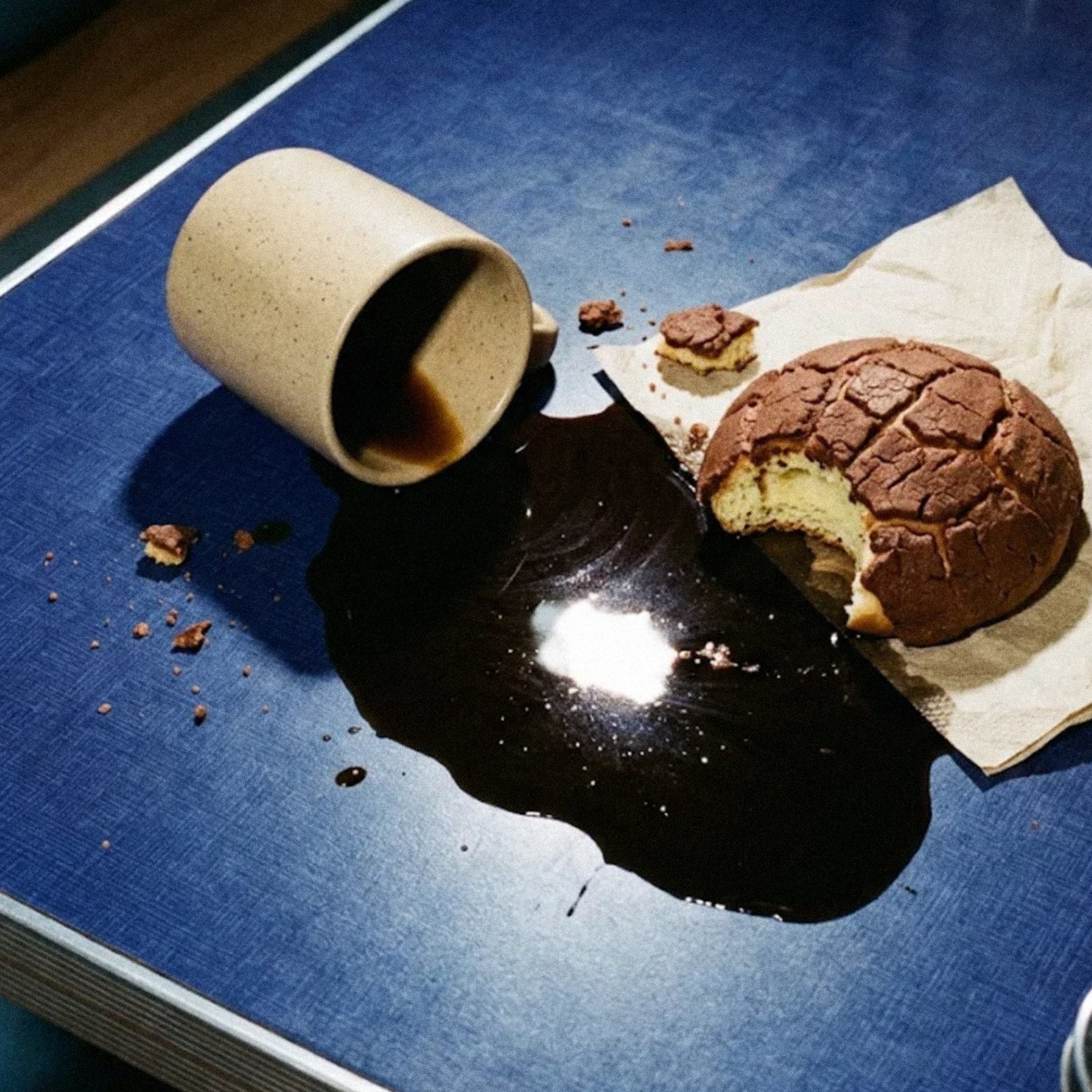
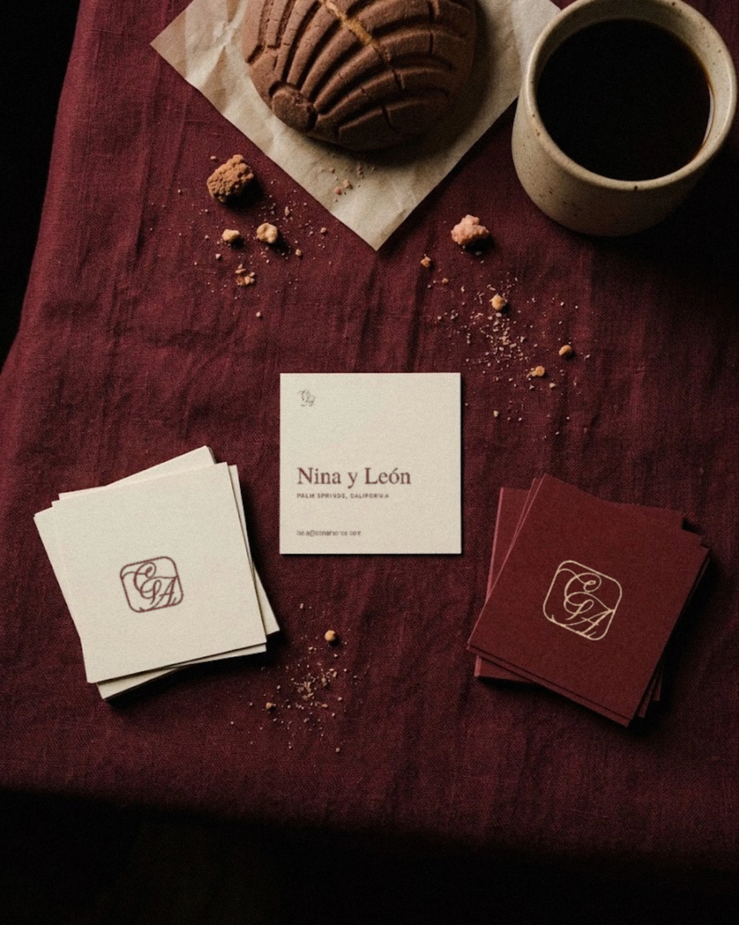
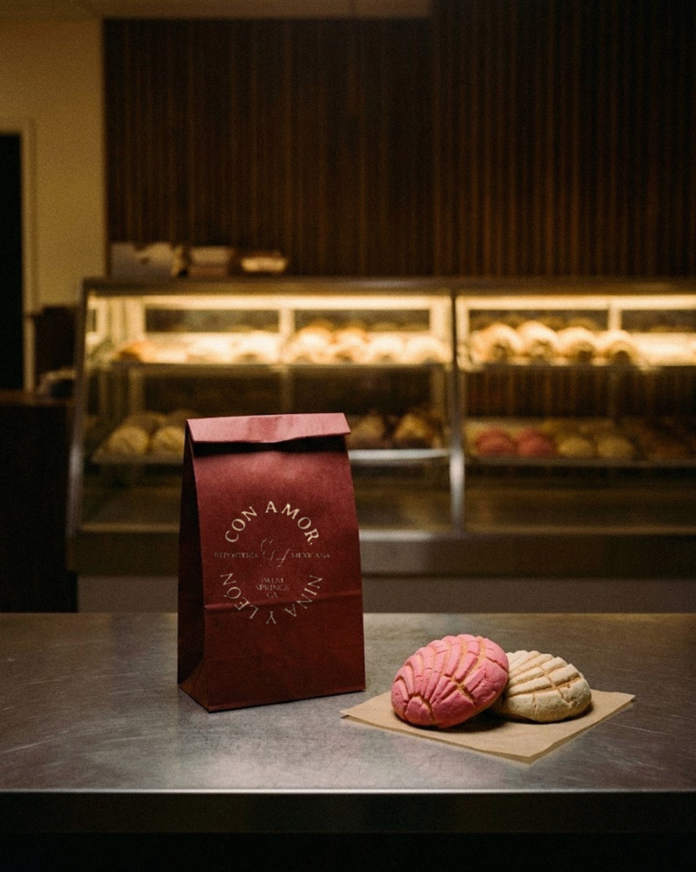
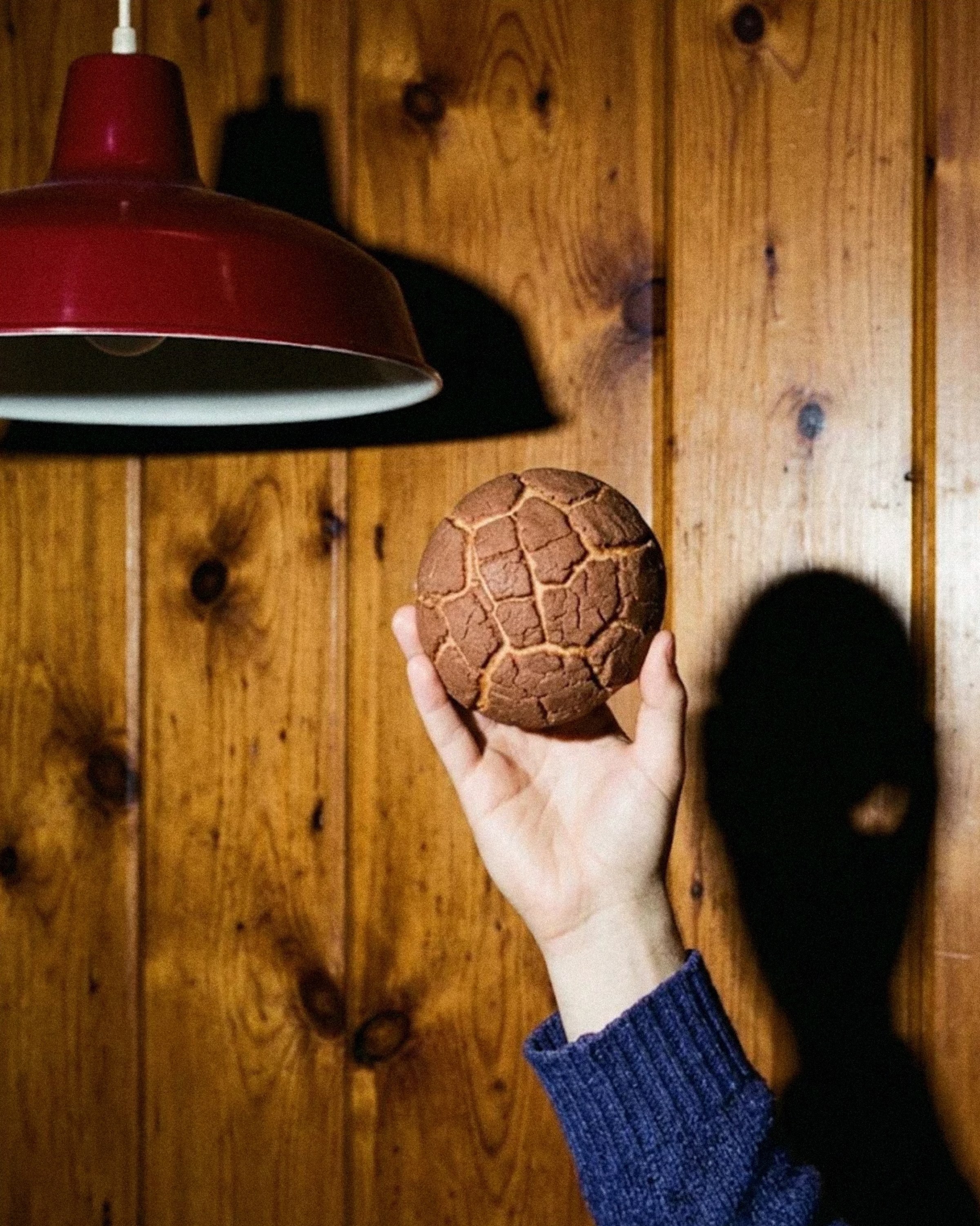
Square business cards, seal-stamped pastry bags, and a wordmark hand-painted straight onto the storefront round out the set. I art directed two photo moods for it: low, warm window light for the product, and direct flash on film to rough it up.
Website Design
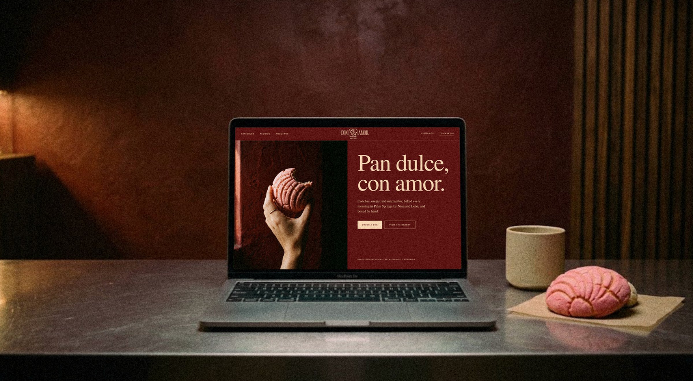
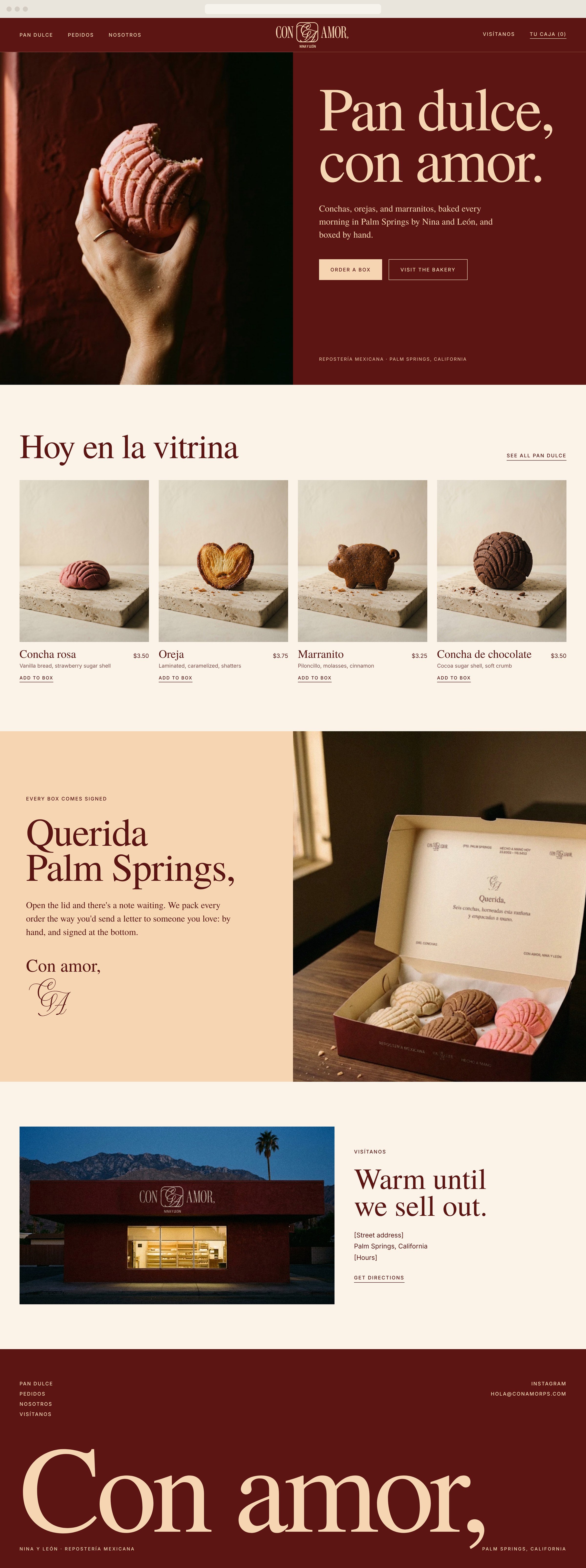
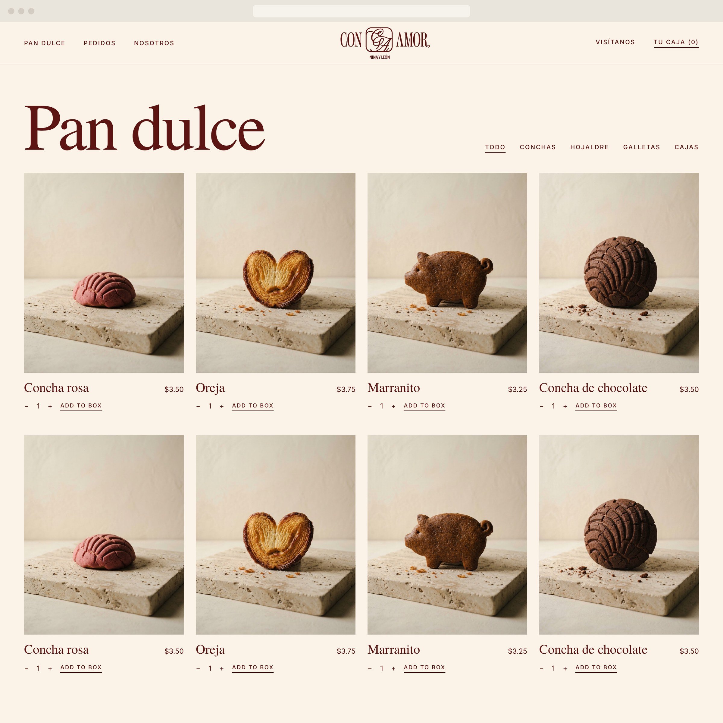
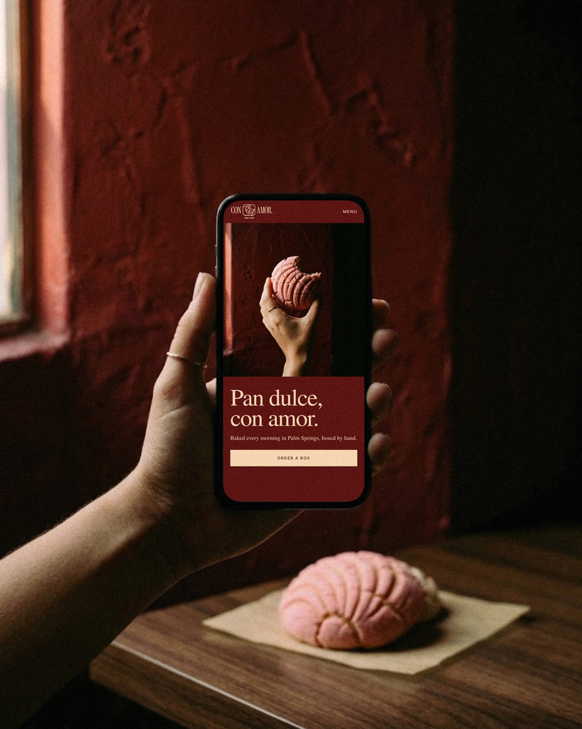
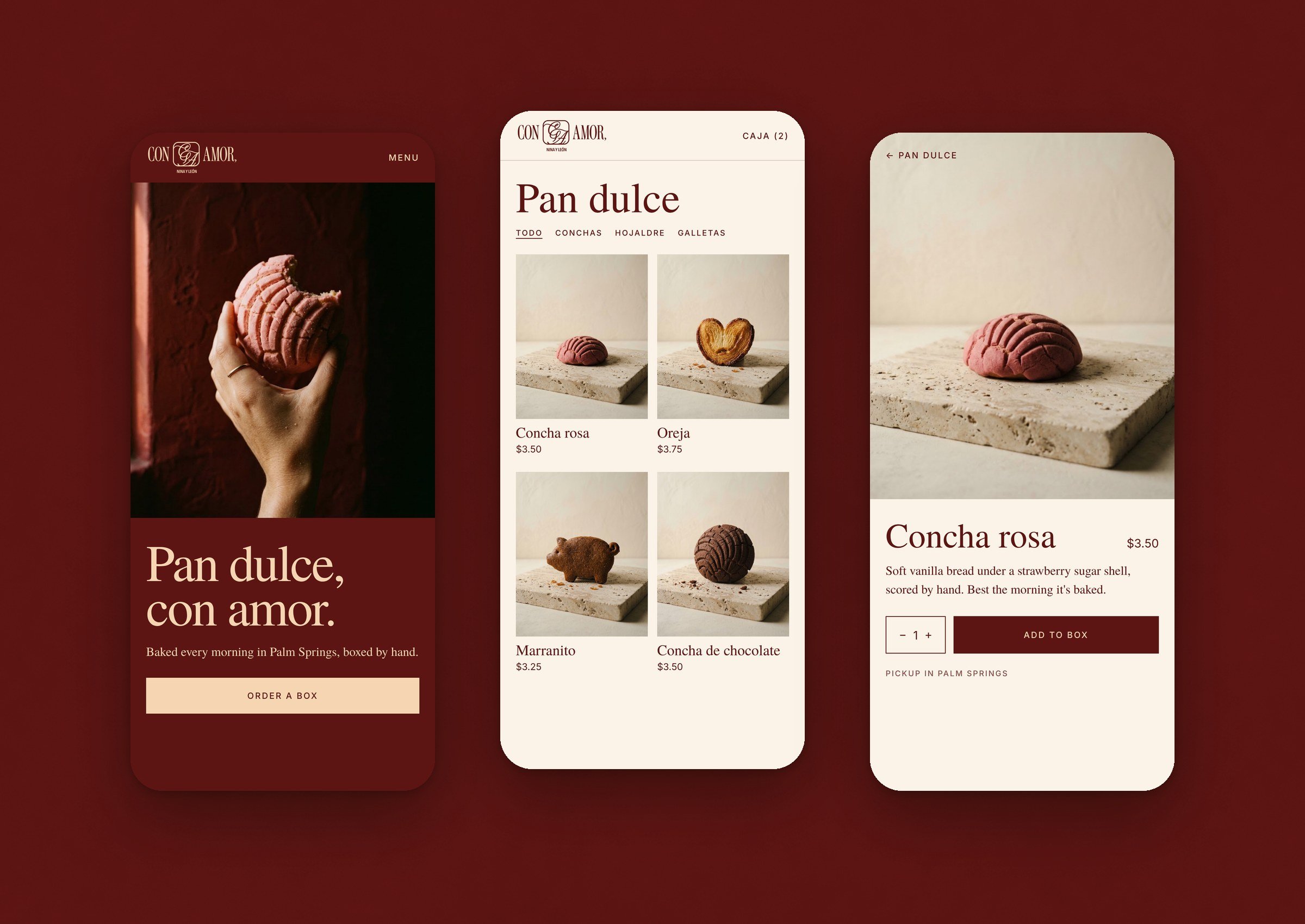
The Con Amor website leads with ordering. The homepage opens on a warm hero and moves straight into what’s in the case today. Each pastry sits on the same travertine slab, so the pan dulce shop reads as one calm, consistent grid.
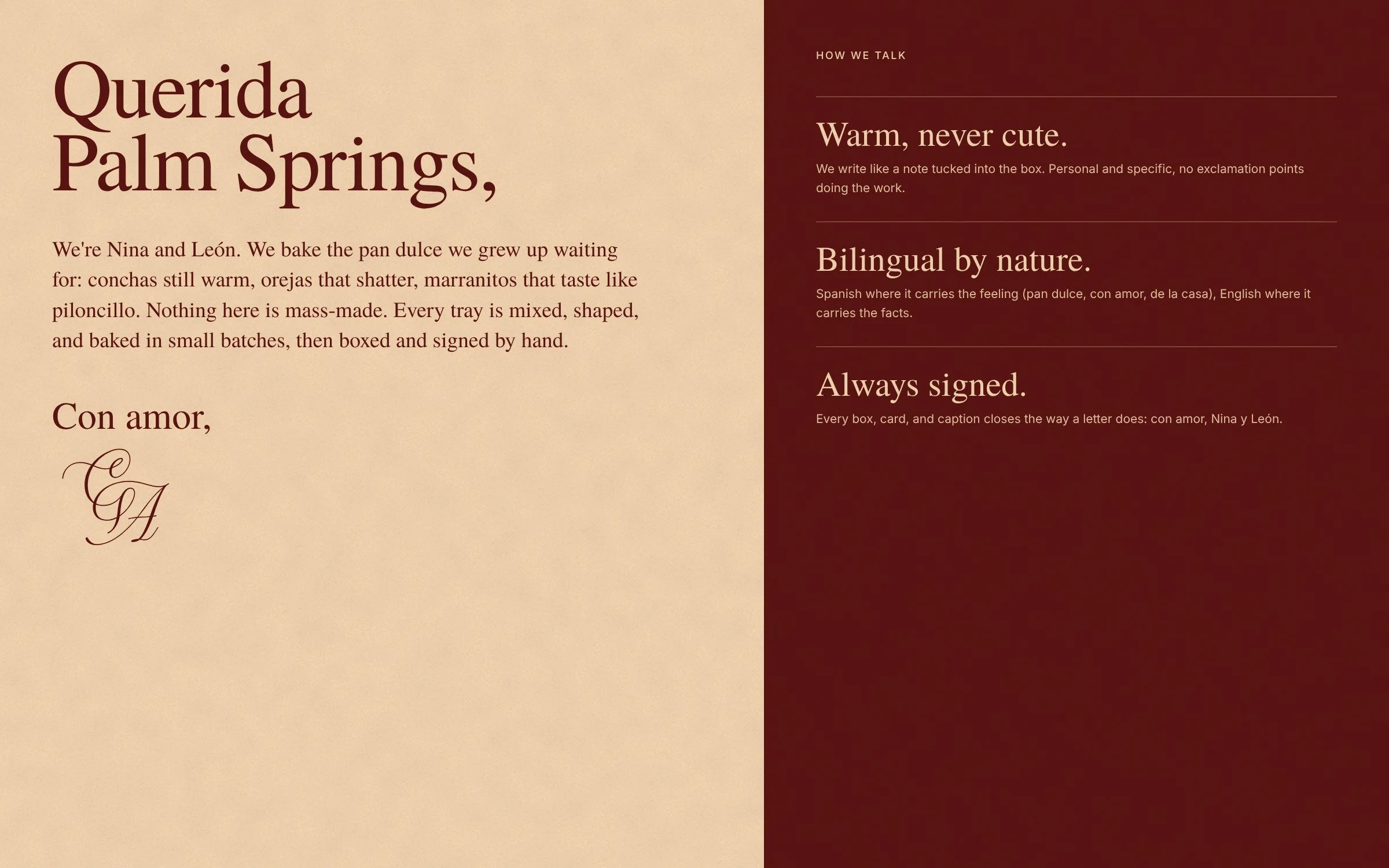
A letter section explains the signed boxes, and a visit section points people to the Palm Springs storefront. The copy is bilingual where it carries the feeling and plain English where it carries the facts.
UI/UX Design
On mobile, ordering a box takes three screens: the homepage, a two-column pan dulce grid with category filters, and a product page with a quantity stepper and Add to box button. Type sizes and spacing scale down from desktop without losing the editorial serif.
Social Content
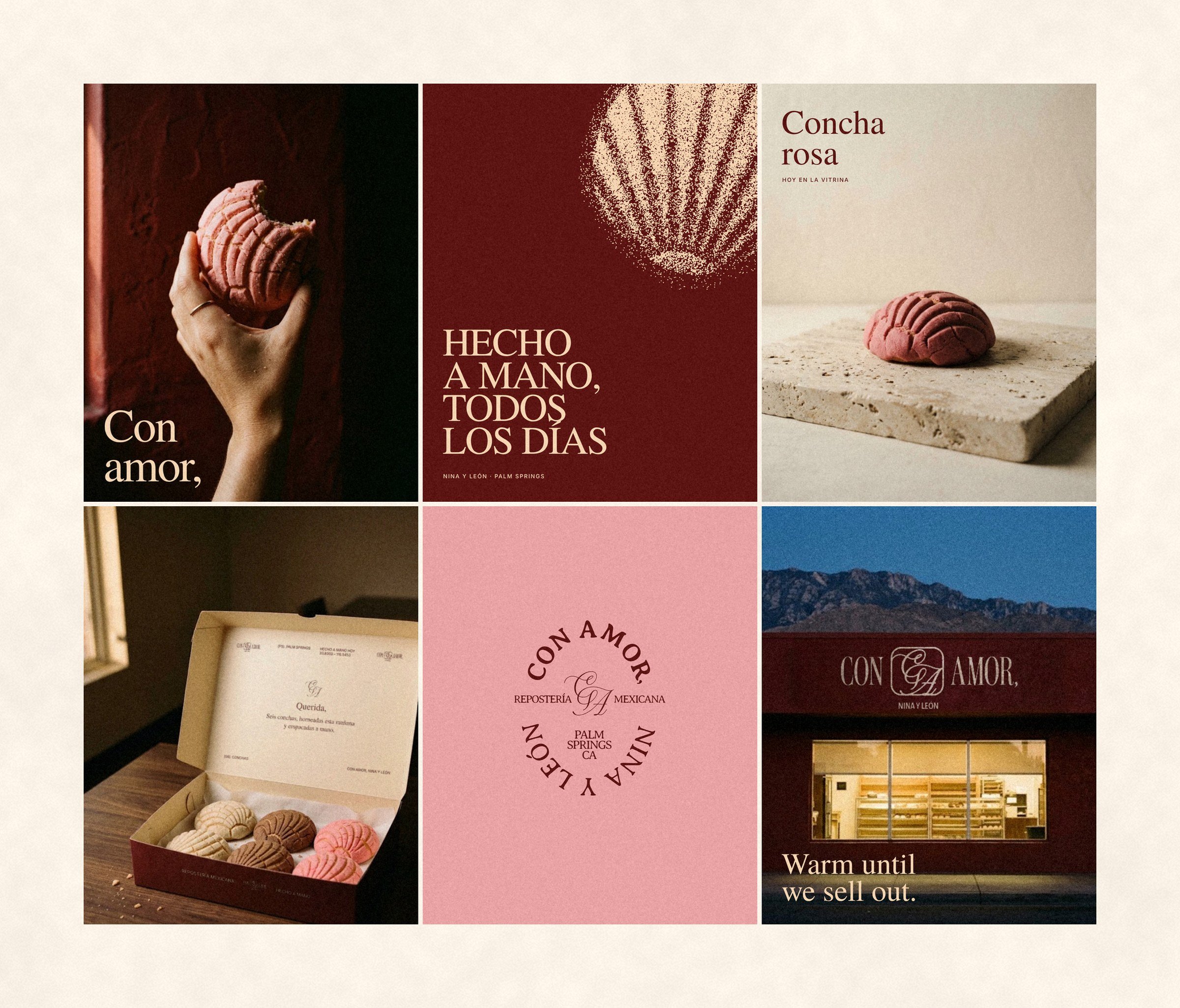
The Instagram feed alternates close food photography with type-led posts, so the grid reads as one brand. Stories carry the signed-box idea into full-bleed frames.
Case Studies
Hospitality
Retail · Wellness