Savory Scallion
Brand Evolution · Website · UI/UX Design
Creative Direction
Brand Identity
Website + UI/UX Design
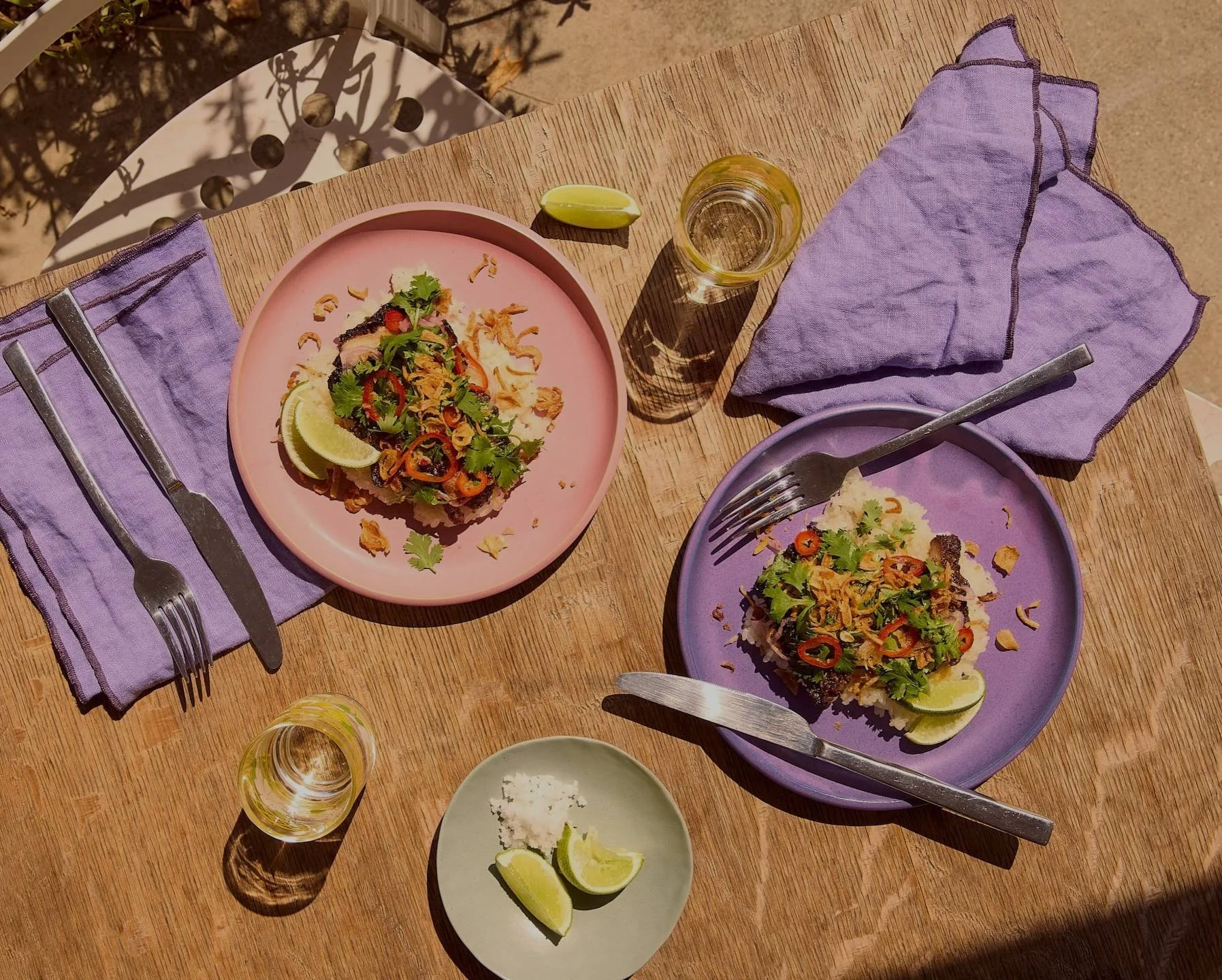
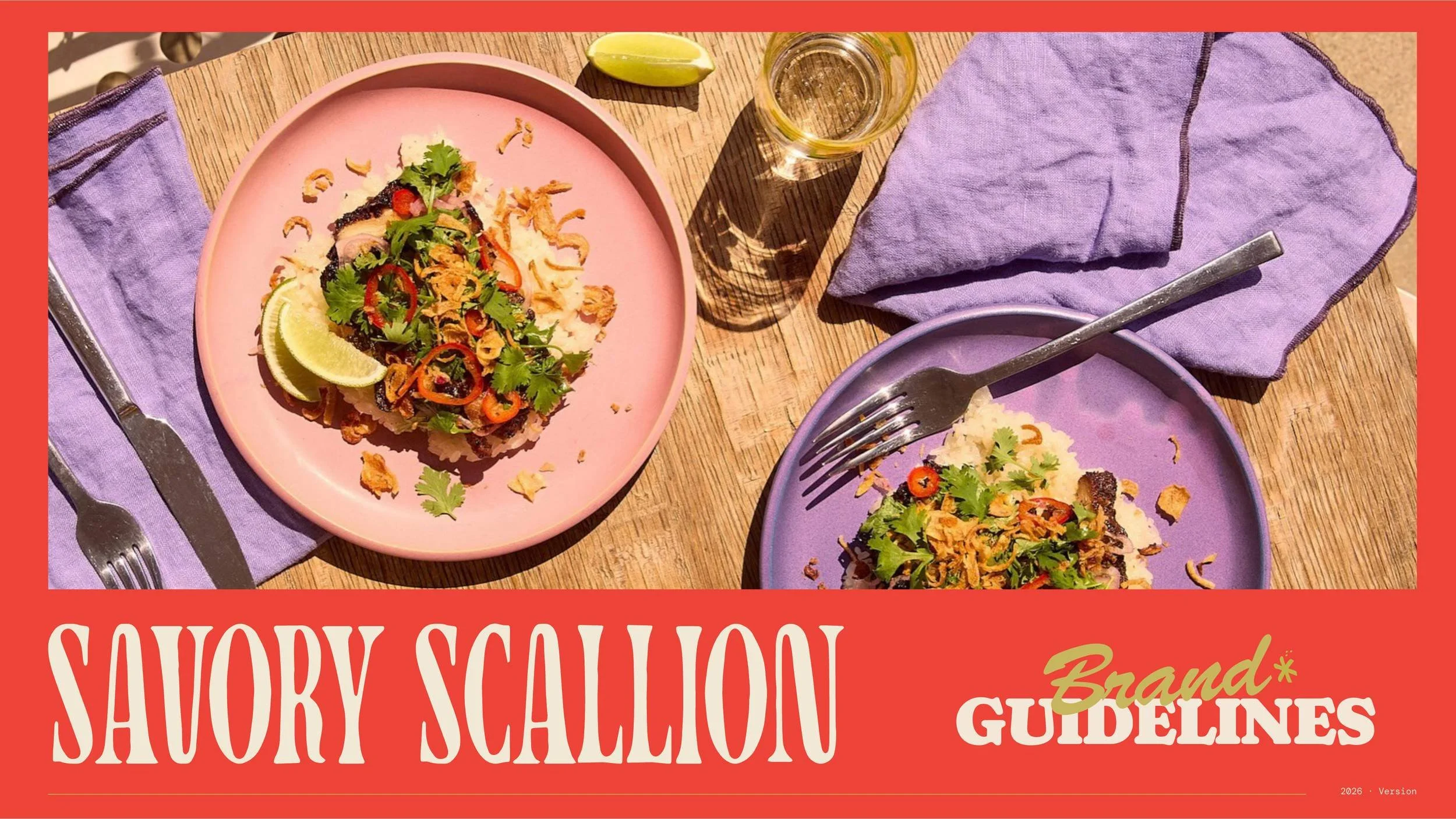
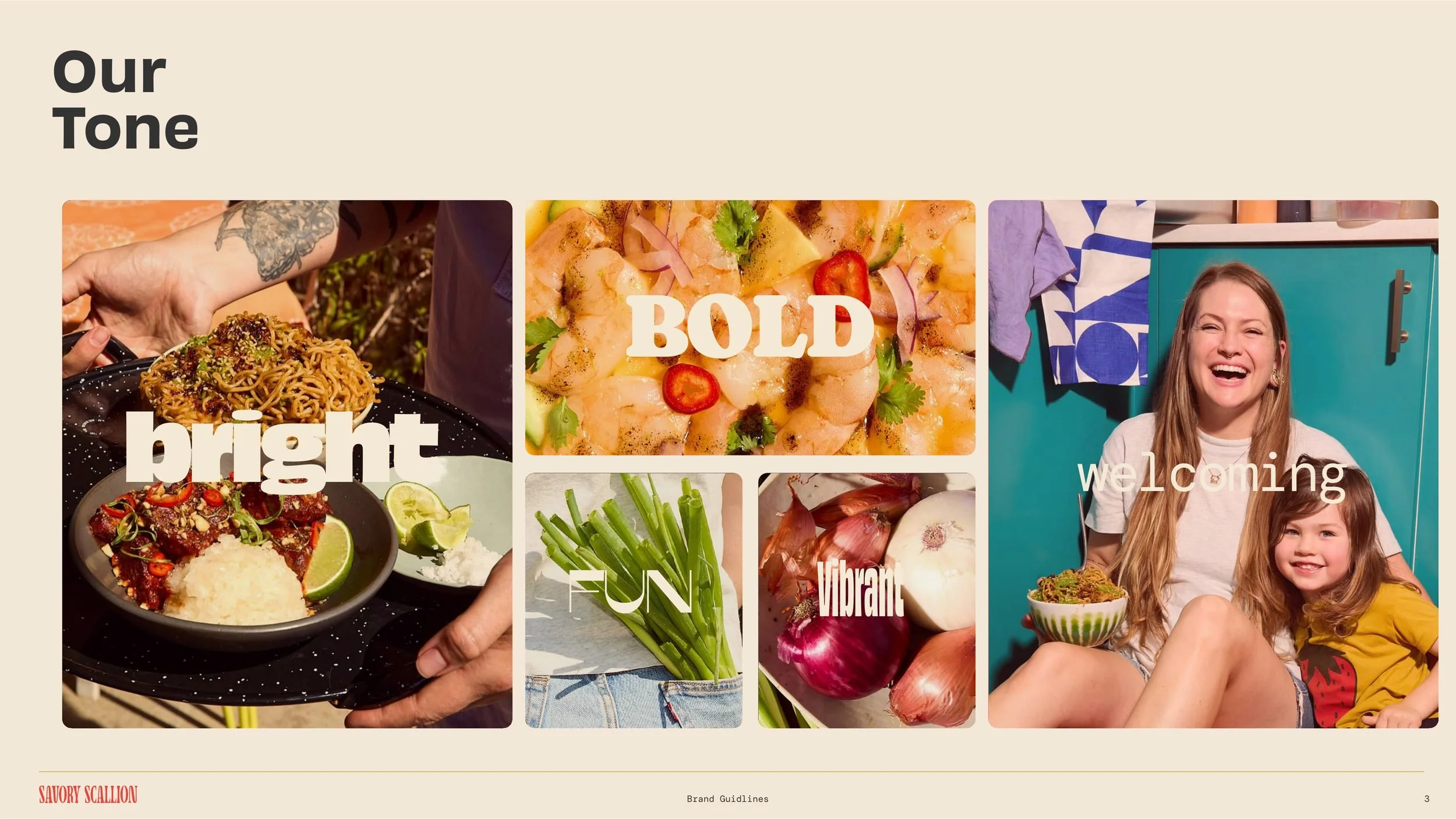
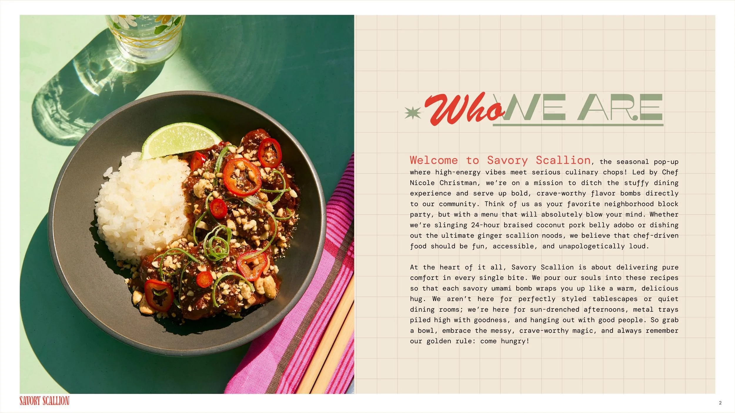
Savory Scallion is a seasonal pop-up from Chef Nicole Christman, serving bold, chef-driven food across Southern California’s Inland Empire, from Upland to Claremont and Pomona, without the stuffiness of fine dining. I led the brand evolution end to end, from the identity system through website design and UI/UX, so the brand feels as loud, warm and generous as the food.
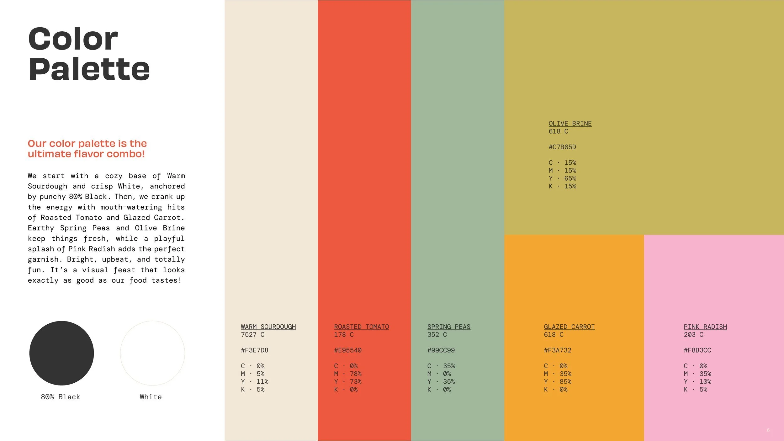
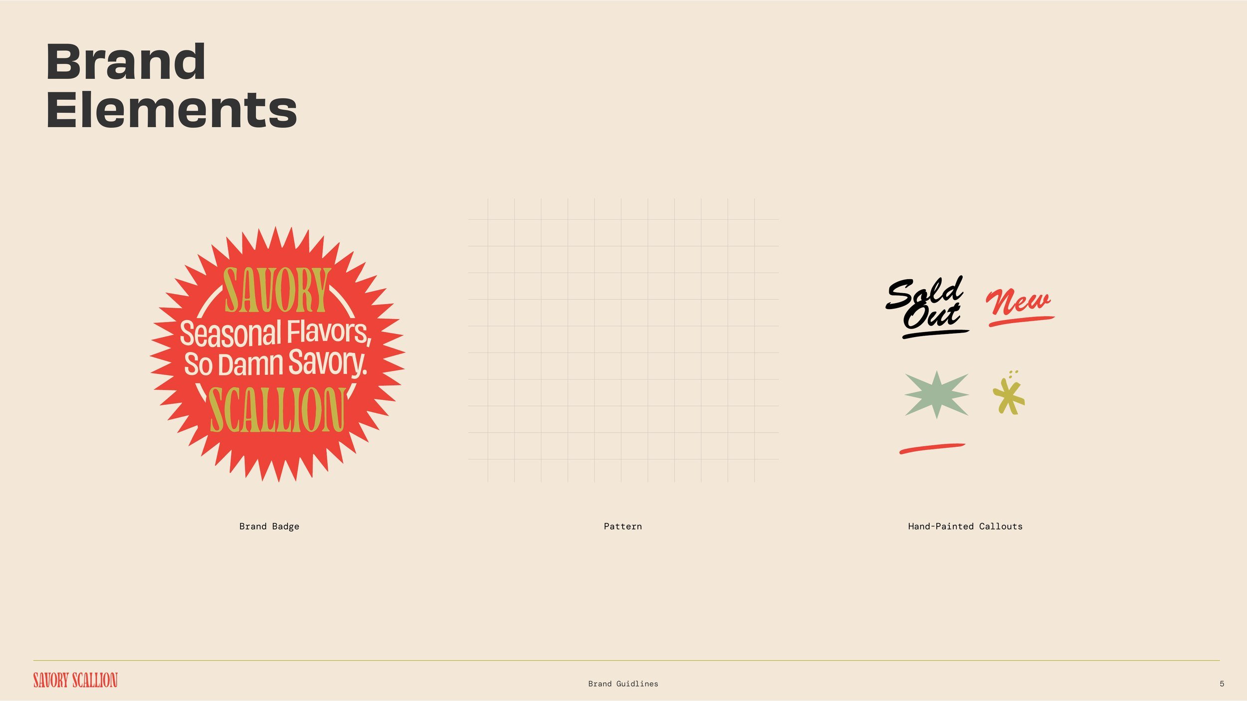
The direction pulls from hand-painted signage and vintage food packaging: a condensed, characterful wordmark, a palette named after the pantry (Warm Sourdough, Roasted Tomato, Spring Peas, Glazed Carrot, Pink Radish and Olive Brine) and a toolkit of brush callouts and starburst badges that lets a small team turn out weekly content fast without losing the look.
Brand Evolution
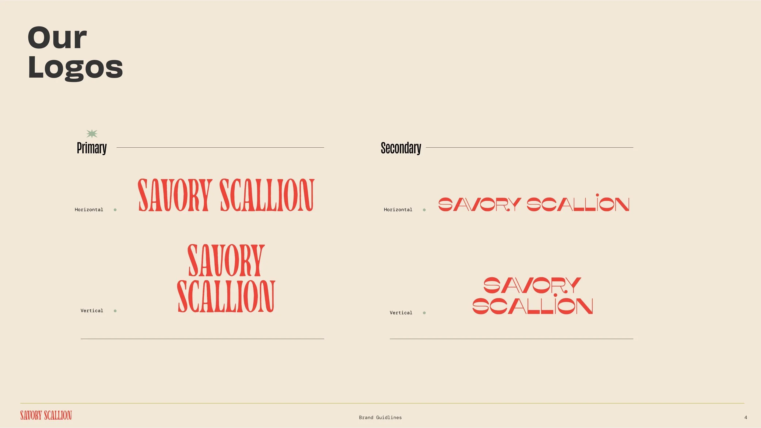
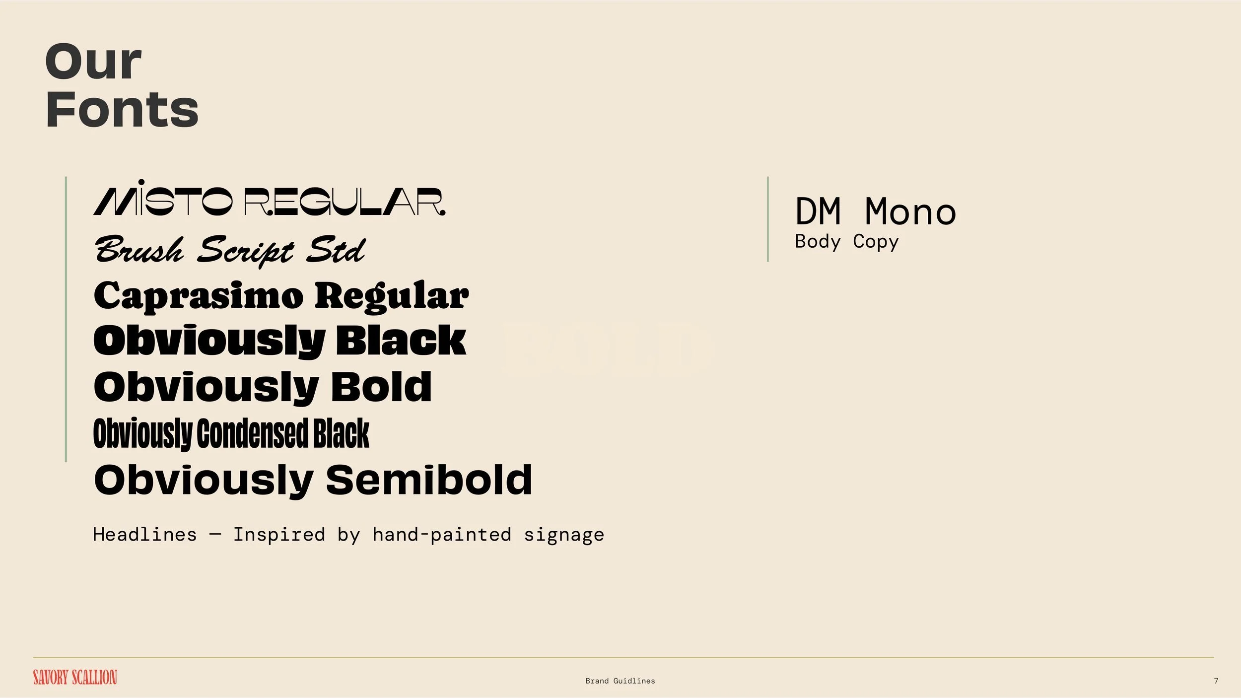
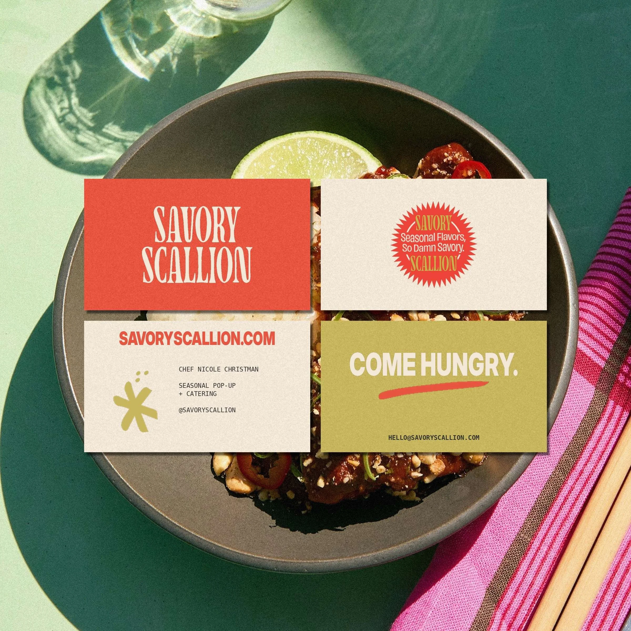
The food was already bold, and the brand needed to catch up. I built a system with range: a primary wordmark in horizontal and vertical lockups, a geometric secondary mark for small applications, the “Seasonal Flavors, So Damn Savory” badge, and a grid pattern borrowed from diner tablecloths that ties every surface together. The guidelines set clear rules for tone, type pairing and color, so every touchpoint speaks with one voice.
Brand Collateral
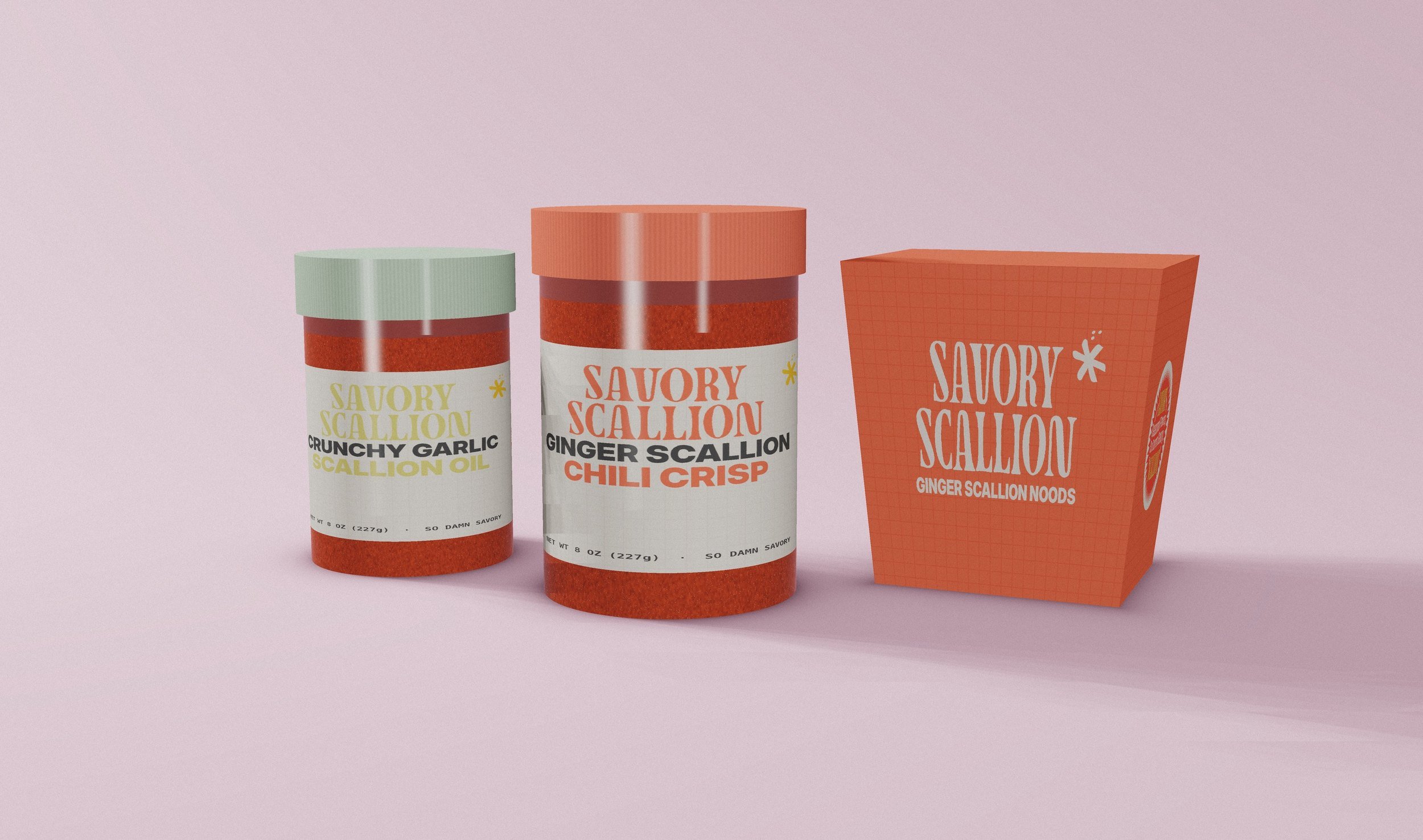
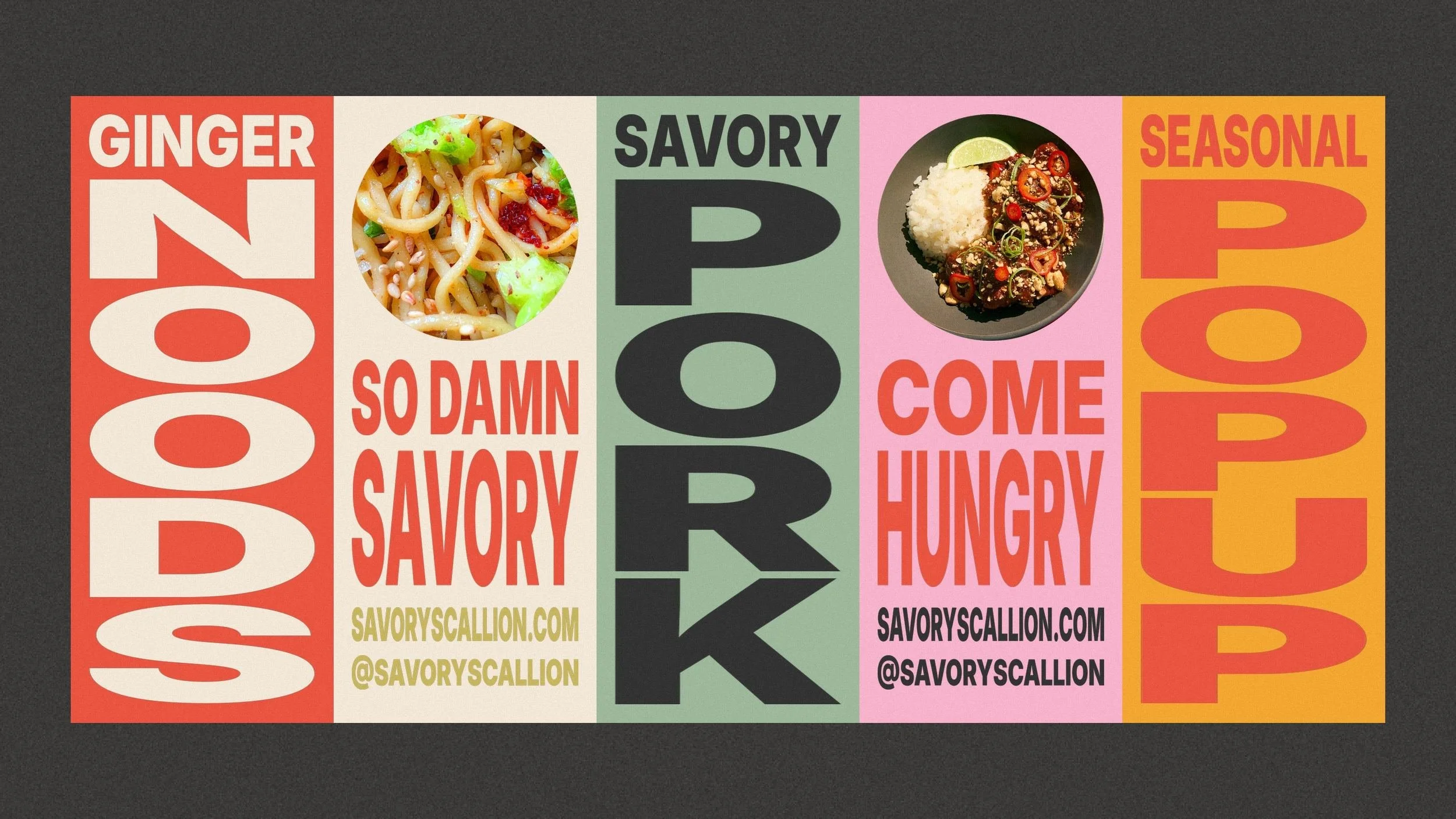
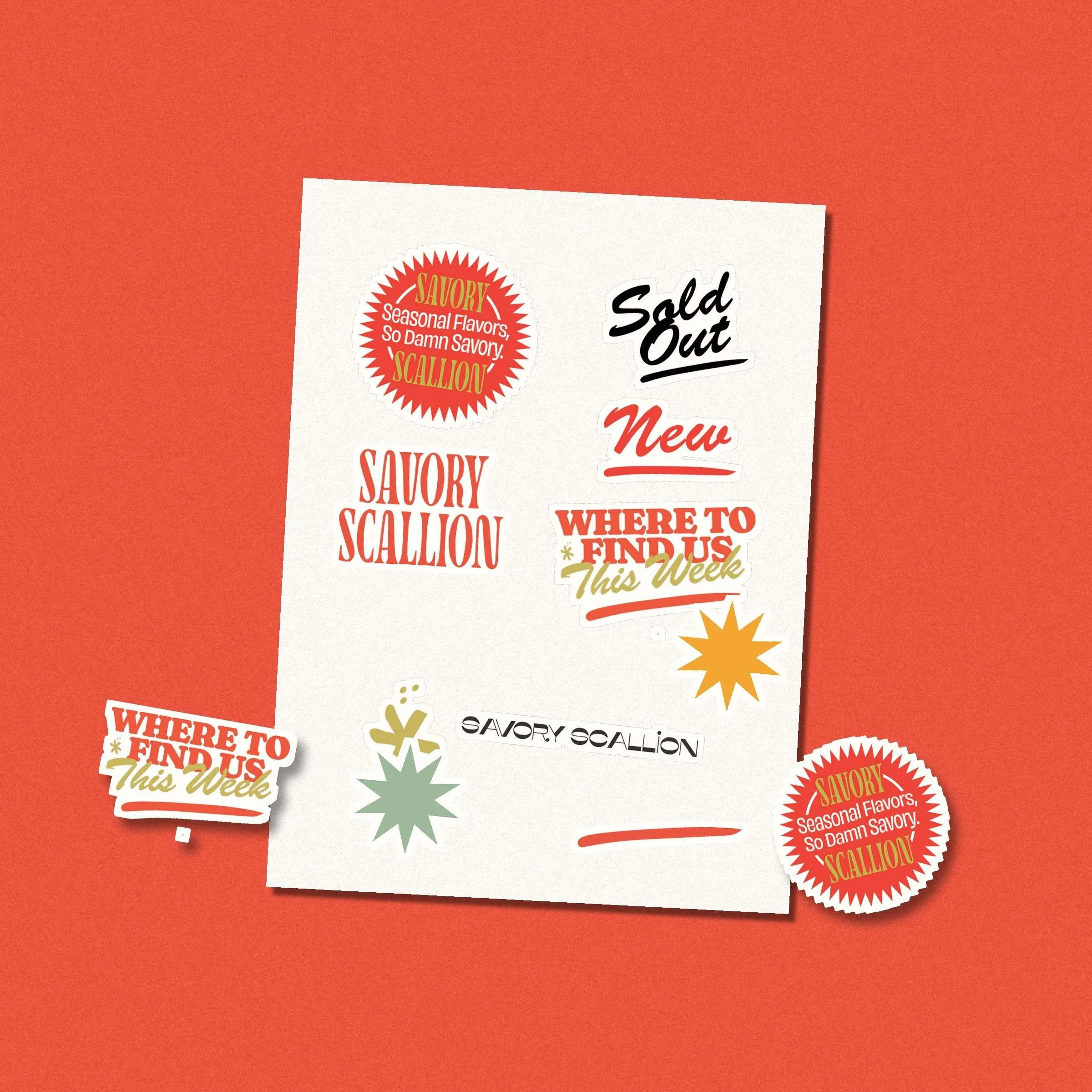
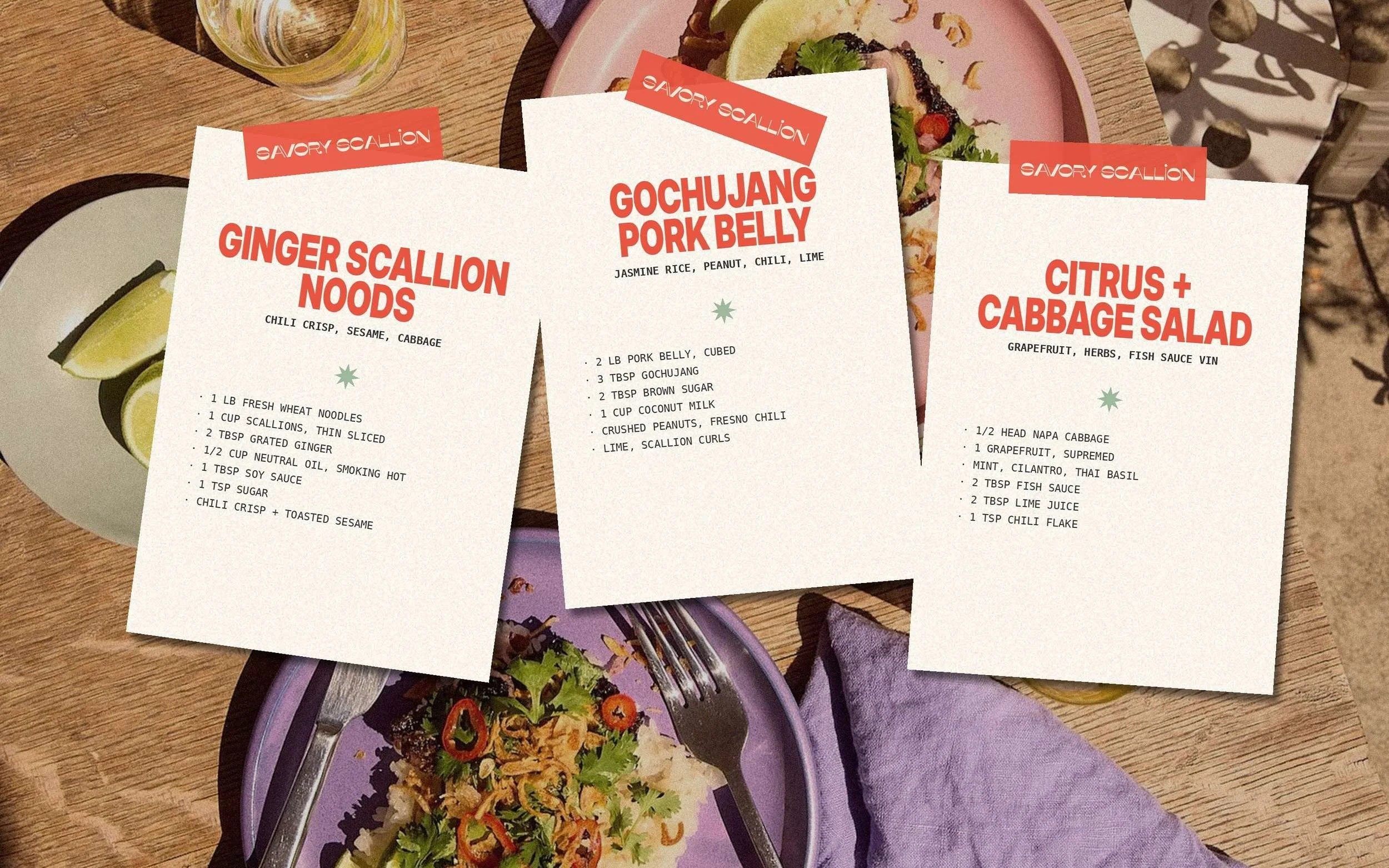
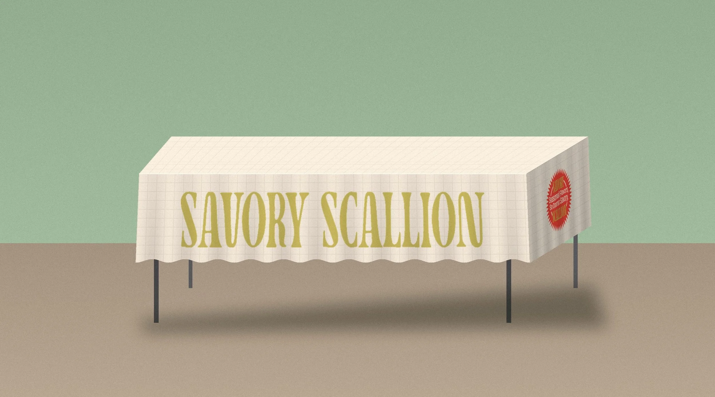
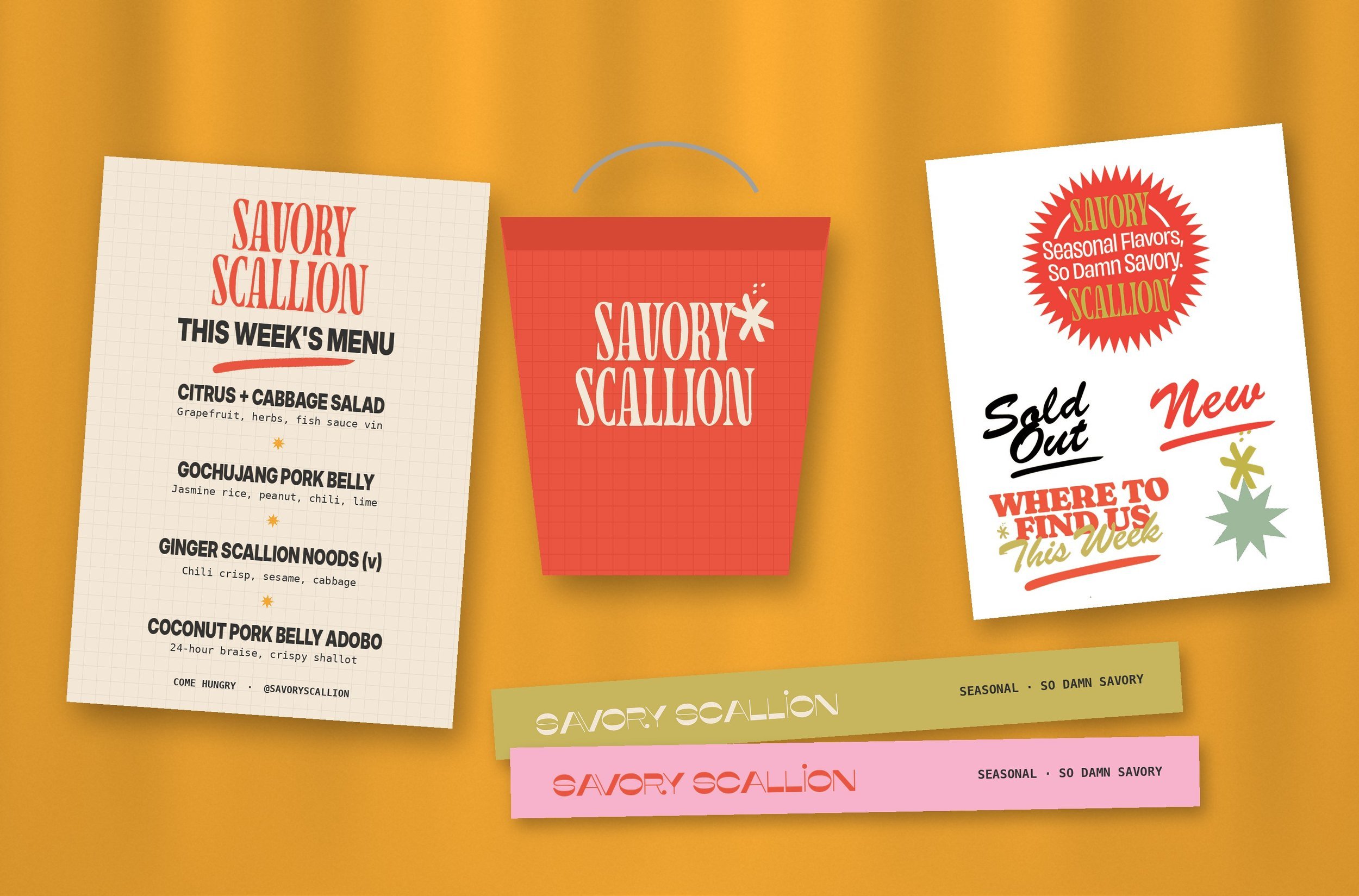
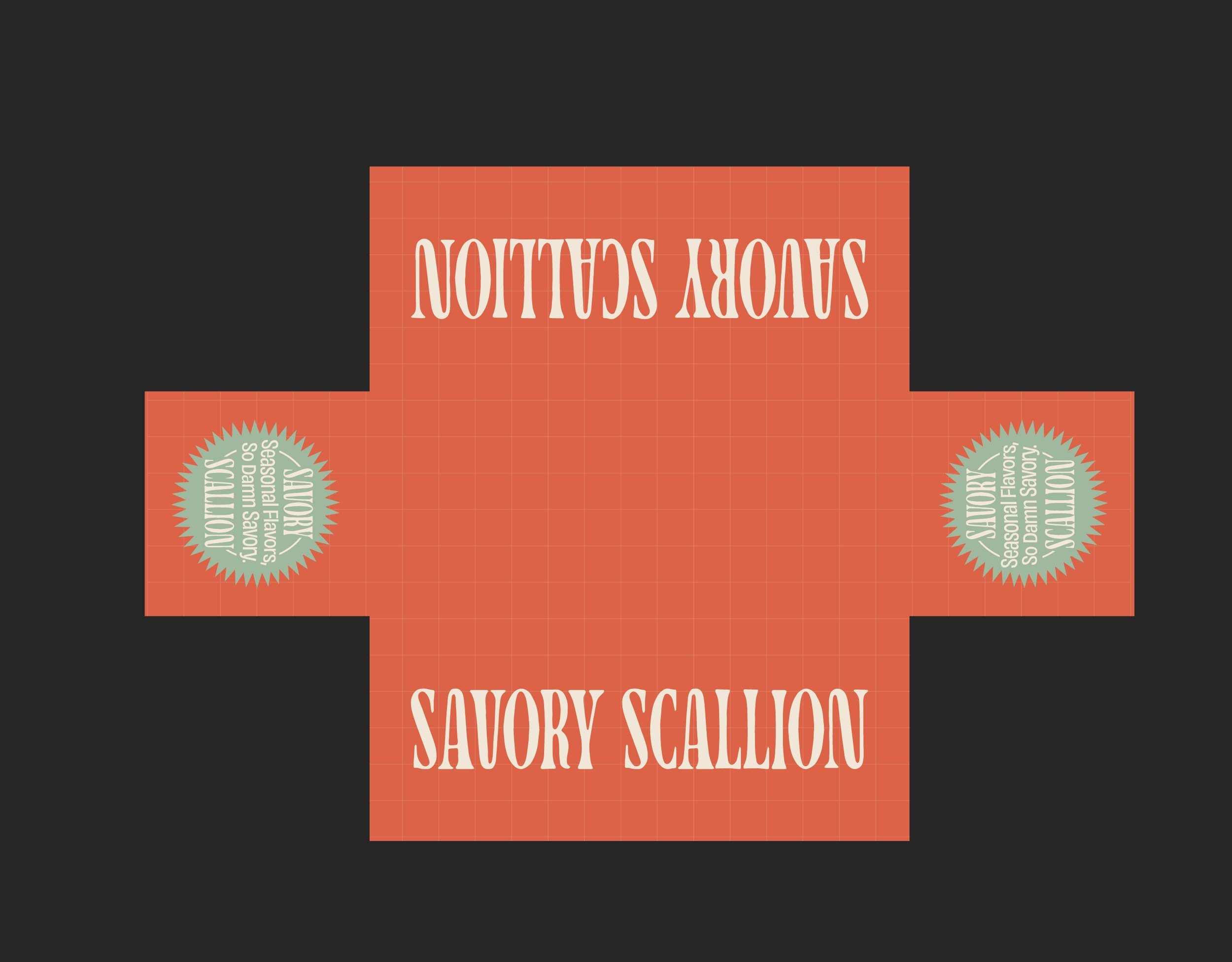
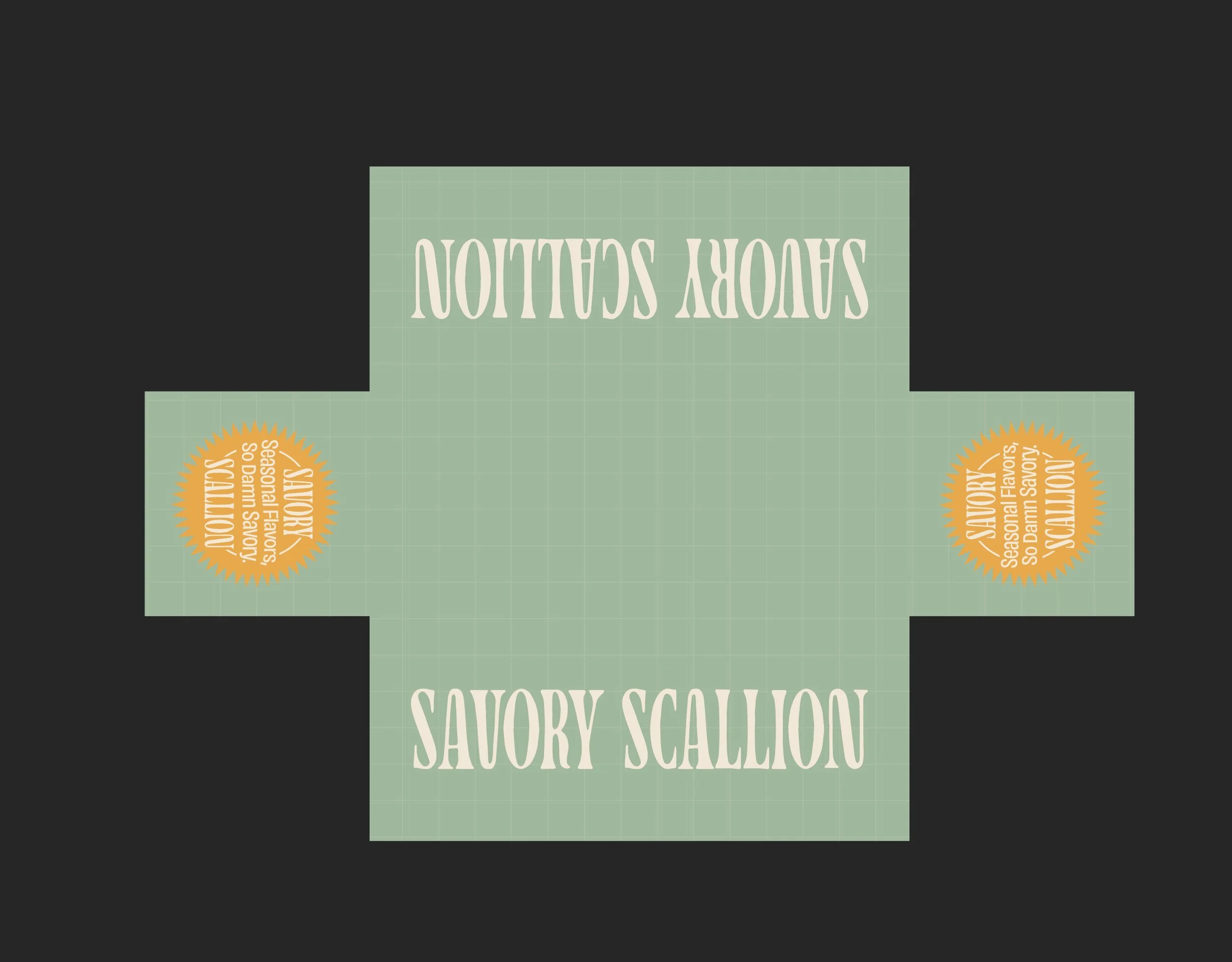
The identity carries off the screen and onto the street and the table: a retail line of chili crisp and scallion oil, a wild-posting system that sets the menu big enough to read from across the lot, business cards, stickers and recipe cards, plus a custom tablecloth explored in four colorways, menus, takeout cartons and chopstick sleeves. Every piece is designed to look good on a folding table and even better in a guest’s photo.
Website Design
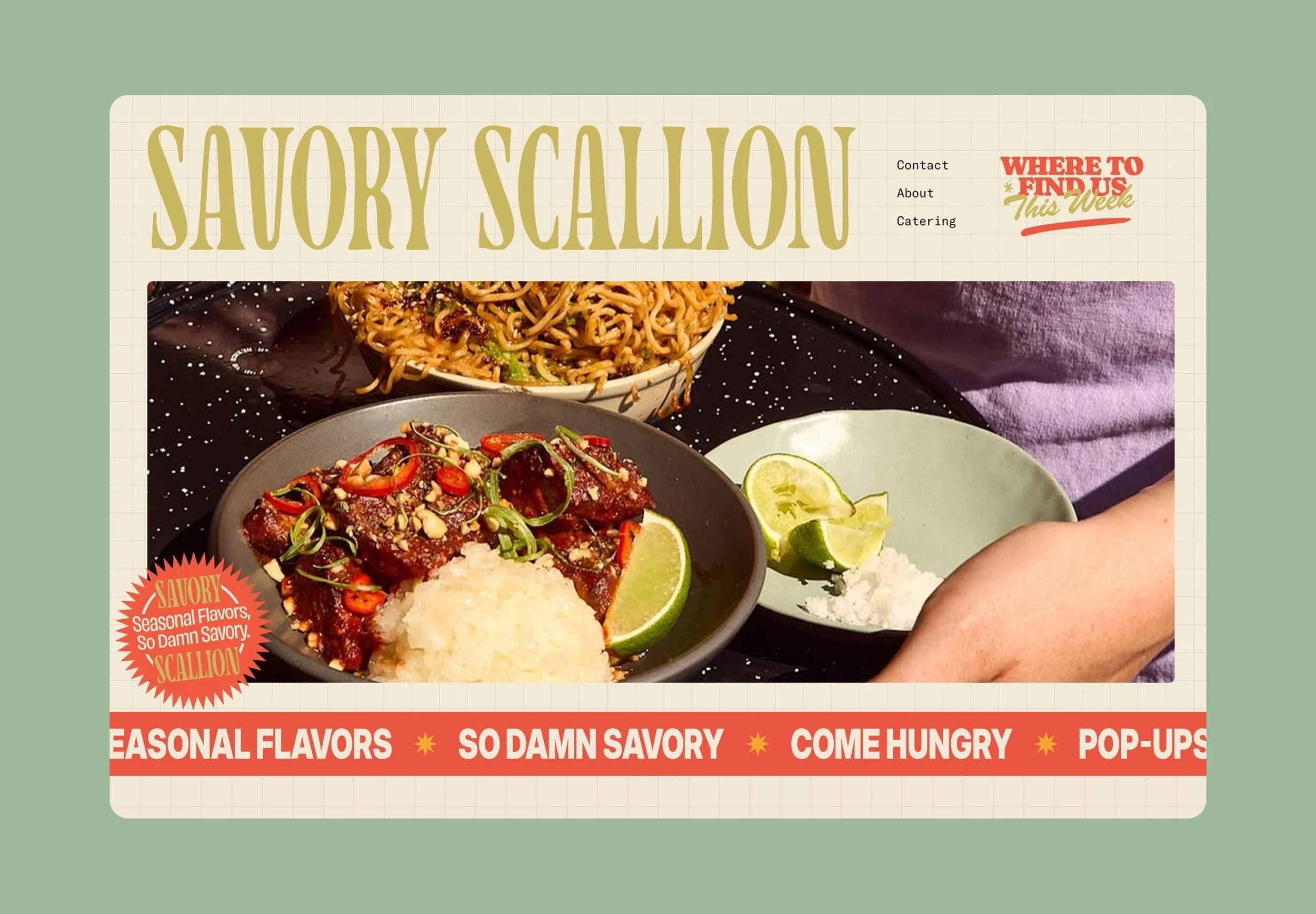
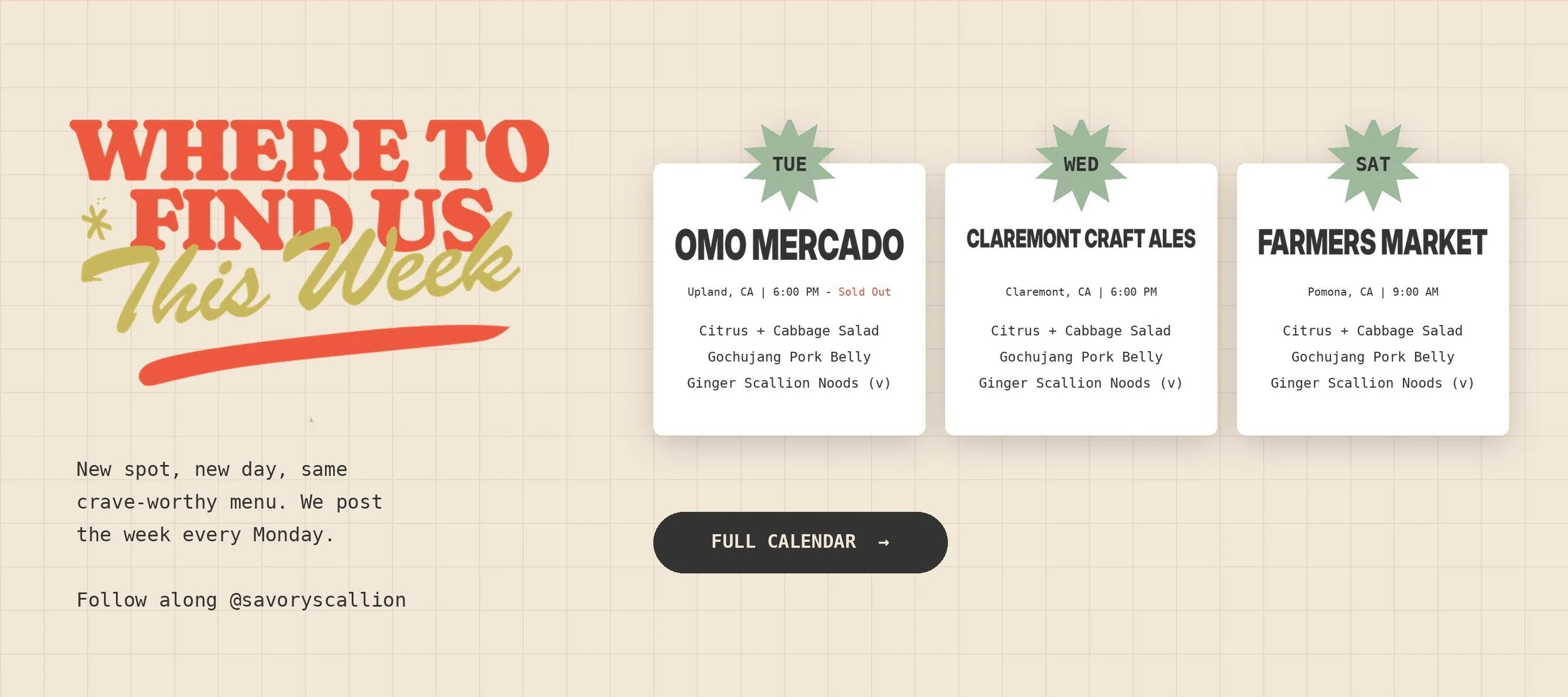
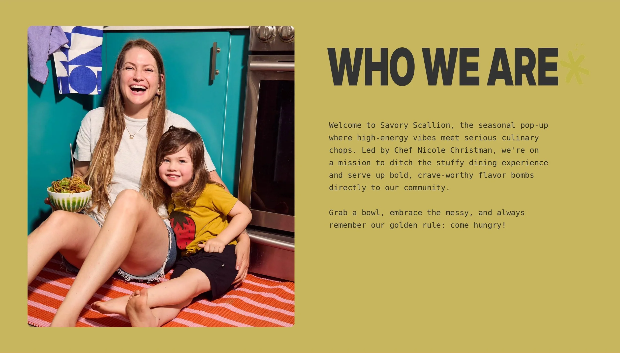
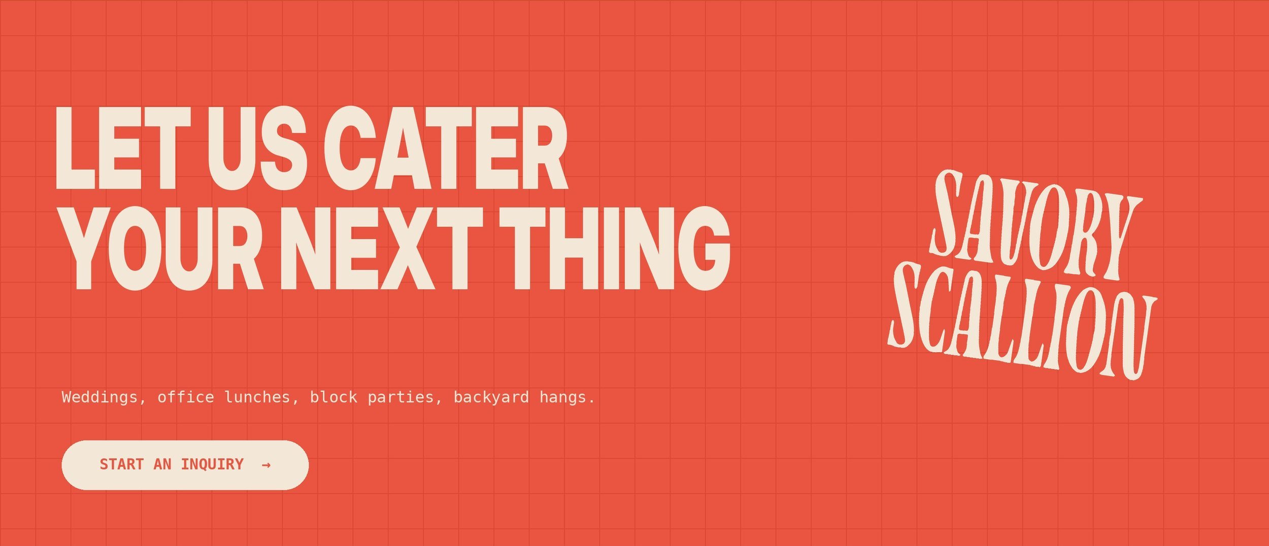
The site is built around the three things a pop-up guest needs: where to find us this week, what’s on the menu, and how to book catering. The wordmark owns the header, the photography does the selling, and the weekly schedule sits at the top of the hierarchy so it’s never more than a scroll away.
UI/UX Design
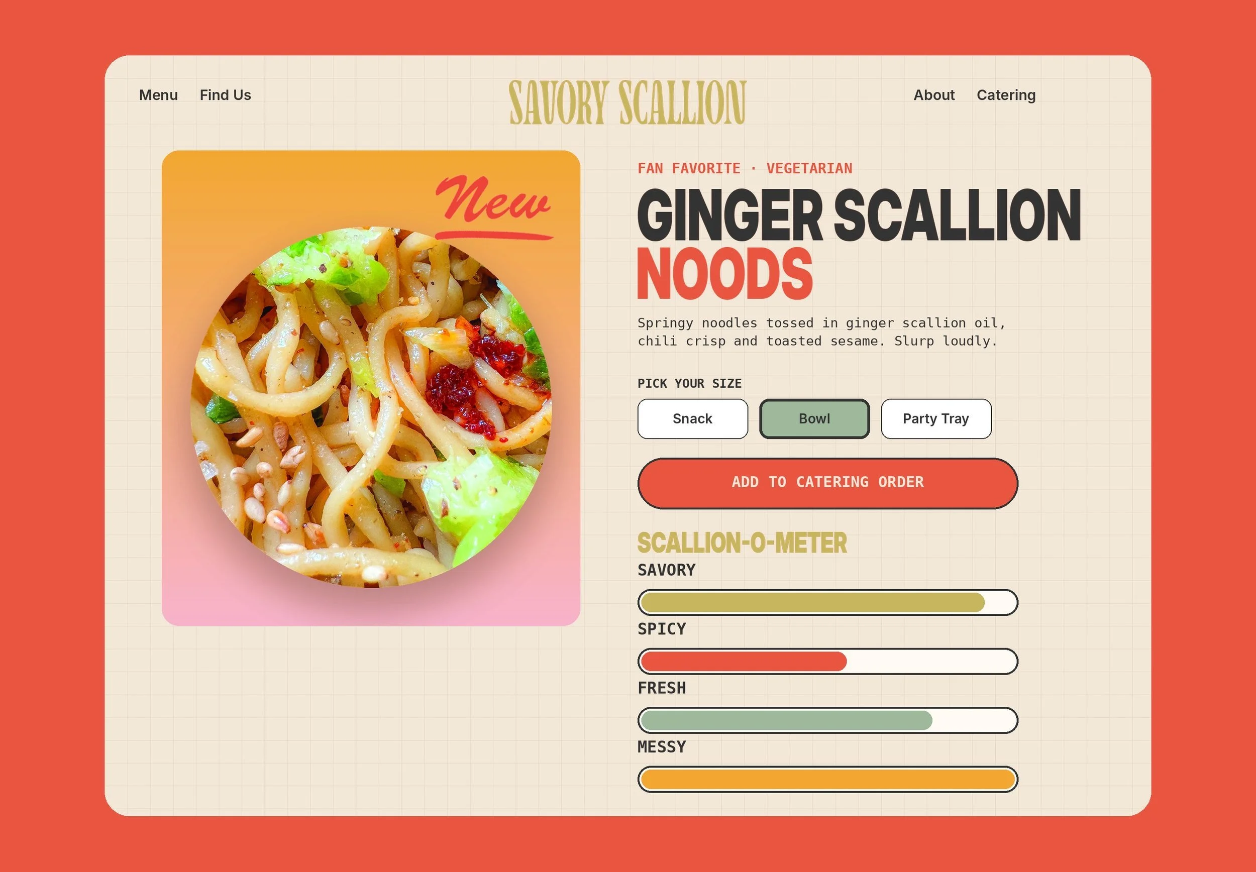
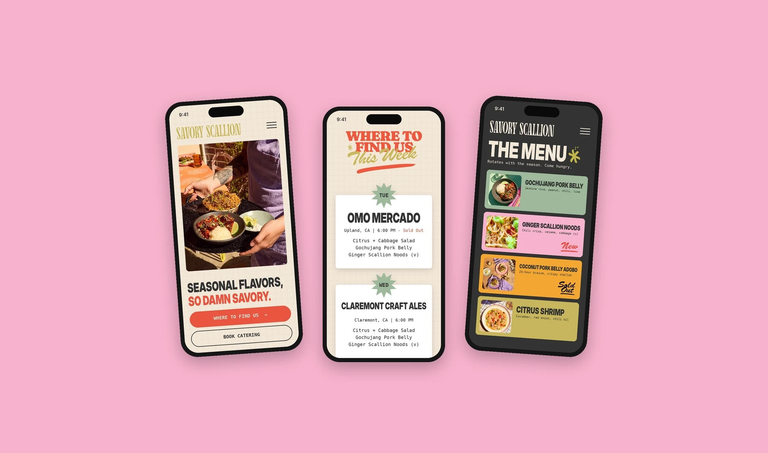
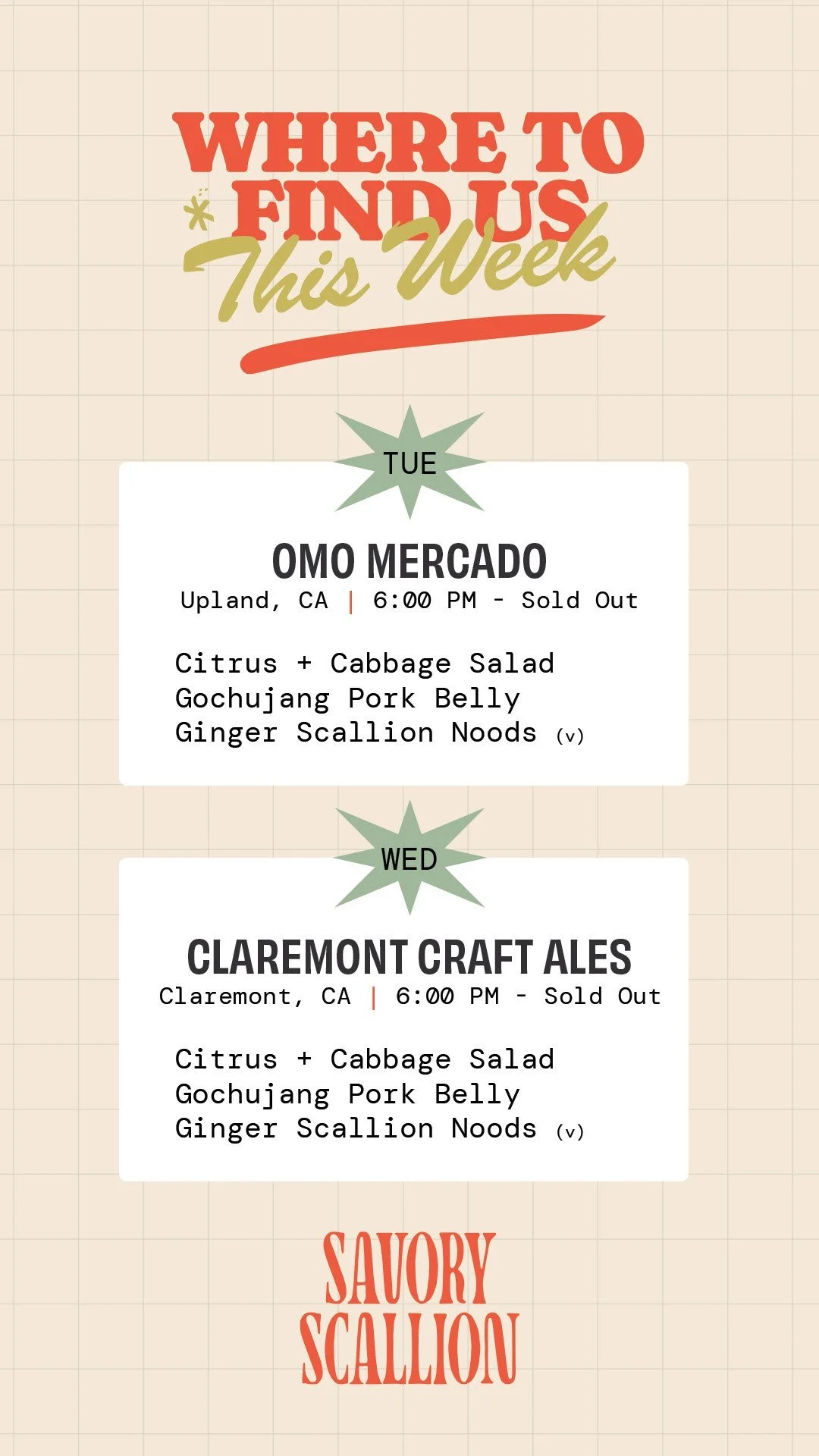
Guests find Savory Scallion through Instagram on their phones, so I designed mobile first. The schedule cards mirror the weekly stories, so returning guests recognize the format instantly. The hand-painted callouts (New, Sold Out) work as real UI states, not decoration, and the two primary actions, Where to Find Us and Book Catering, stay within thumb reach on every screen.
Social Content
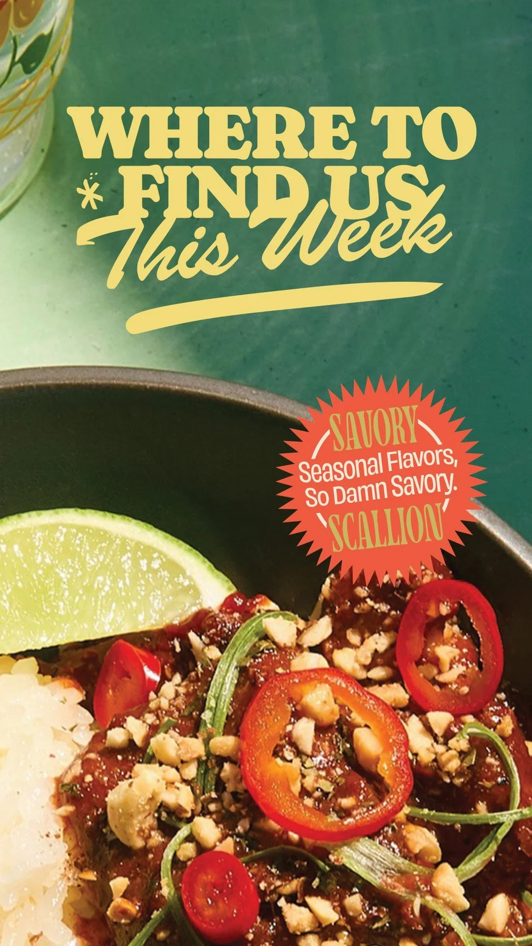
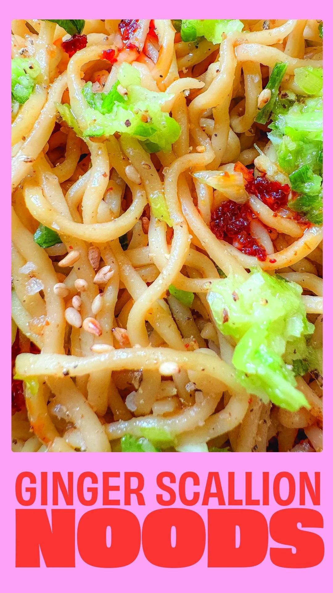
A weekly story system announces each pop-up and spotlights the menu. I built it as editable templates from the brand toolkit, so the team can swap dates, venues and dishes in minutes and every post still looks considered.
Case Studies
Hospitality
Retail · Wellness