Mountain Mike’s Pizza
Brand Identity Refresh
Art Direction
Photography Direction
Lead Designer
This identity was developed at Dreambox, where I led the project as Art Director, shaping the brand from the ground up with a focus on clarity, consistency, and real world application. The goal was to evolve the identity in a way that honored its roots while modernizing it for new audiences and future growth across locations, platforms, and touchpoints. Working closely with the team, we refined the visual language into a flexible system designed to feel current, approachable, and scalable across both physical environments and digital spaces.
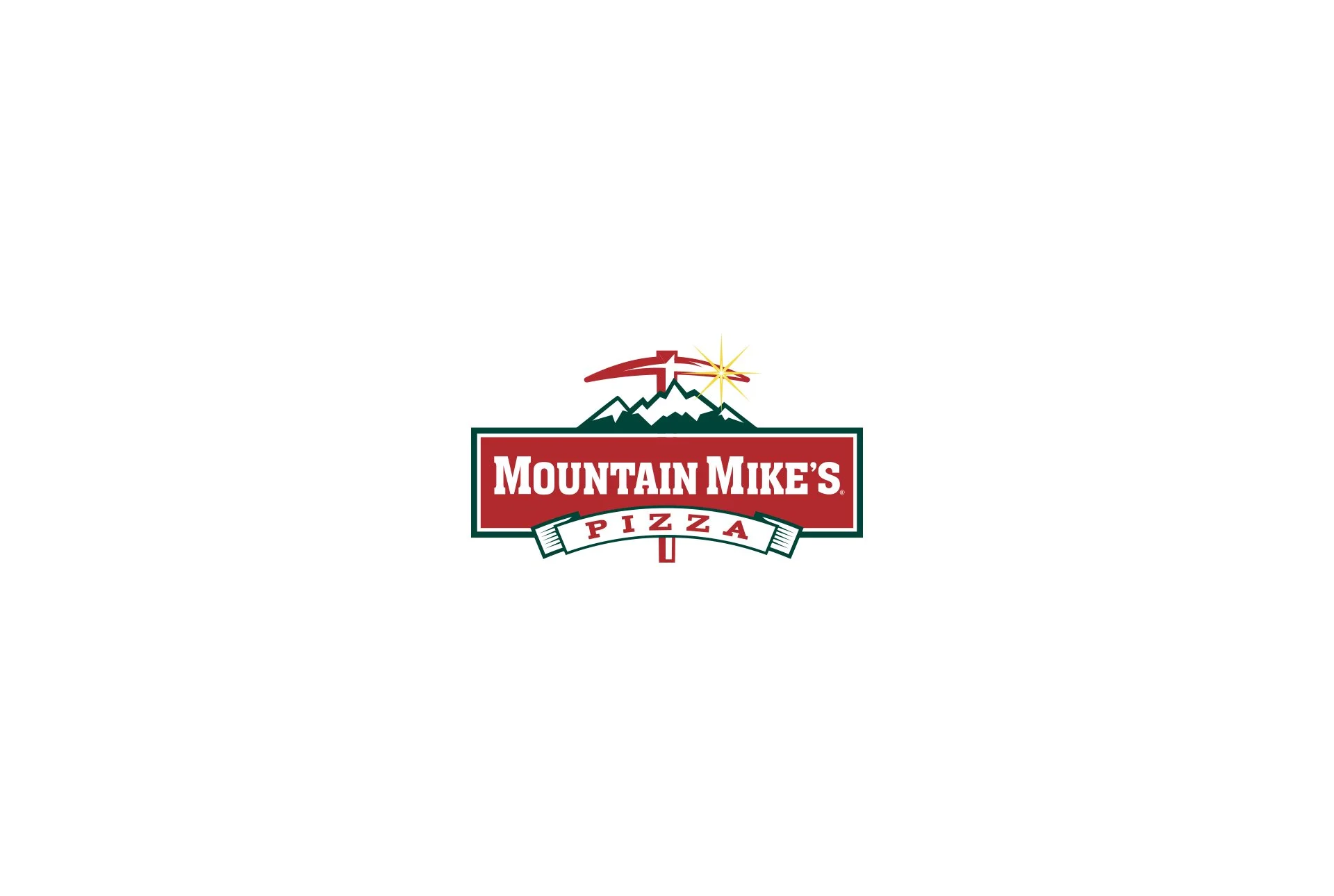
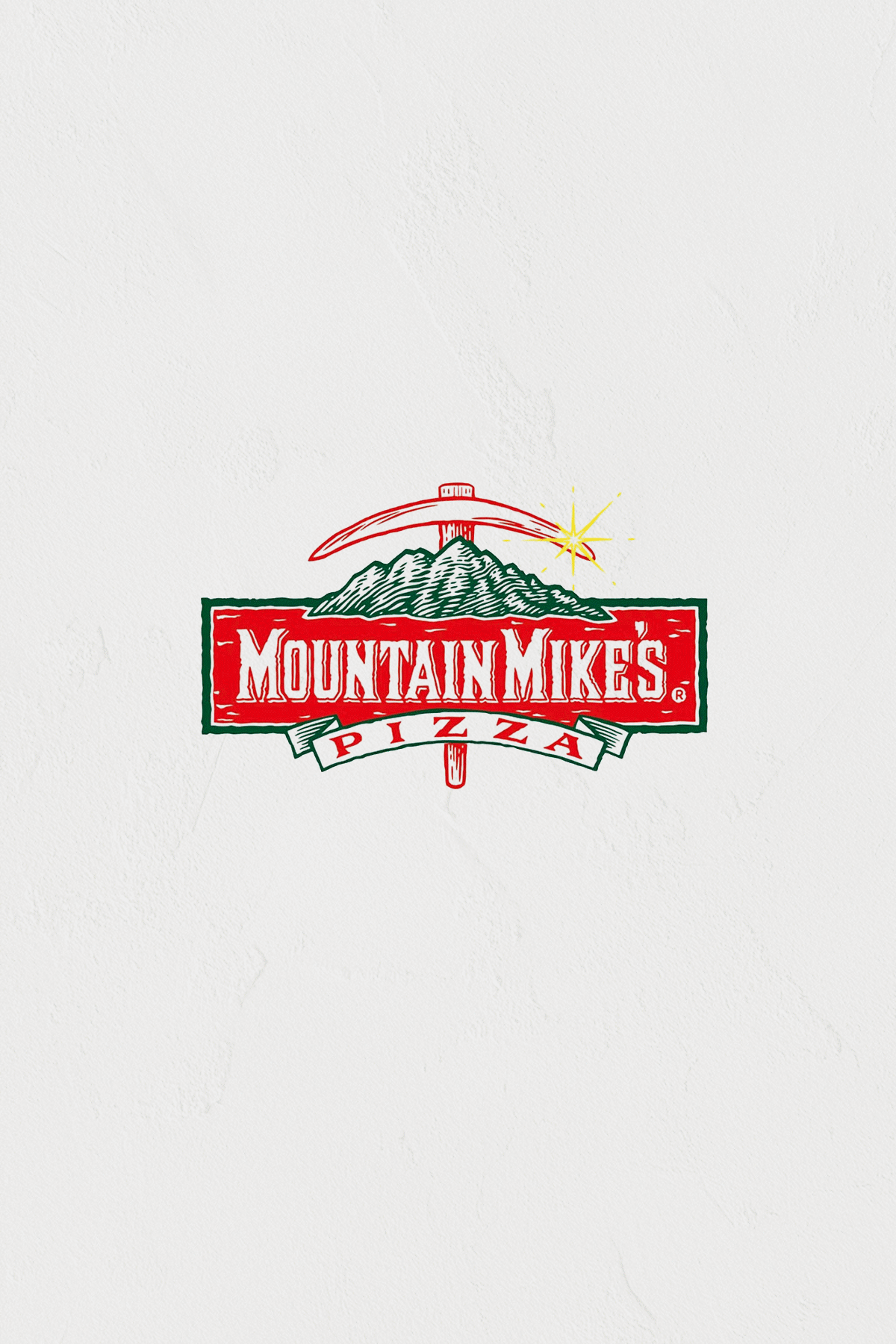
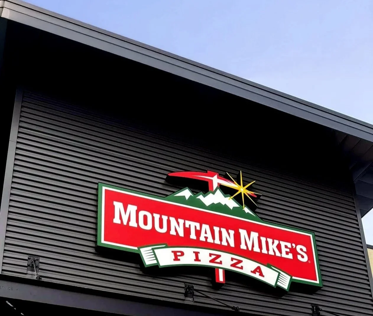
A Natural Evolution of the Logo
As the brand moves into new physical spaces, the logo has to show up in more places and work a lot harder. Storefronts, window vinyl, signage, packaging, screens, social, merch. The original rustic details had a lot of charm, but they started to break down at smaller sizes and from a distance. Simplifying the form was about making sure the logo reads quickly and clearly, whether someone is walking past a new location or seeing it for the first time on their phone.
Moving in a more modern and refined direction felt like a natural evolution. New openings signal growth and confidence, and the logo should reflect that shift. By reducing visual noise and tightening the typography and structure, we kept the mountain influence intact while giving it a more intentional and contemporary presence. It stays rooted in where the brand came from, but now it is designed to scale and live comfortably in today’s spaces.
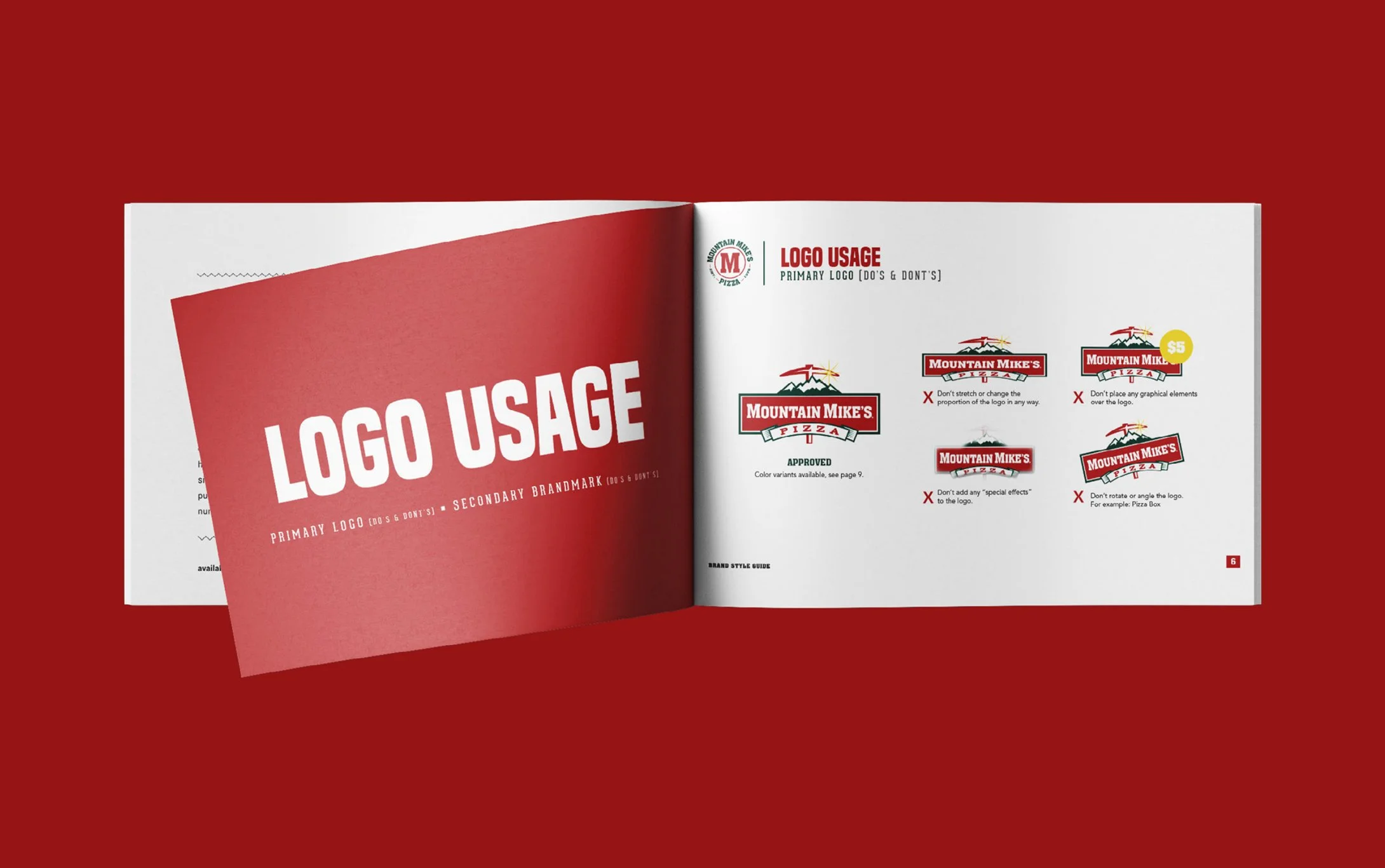
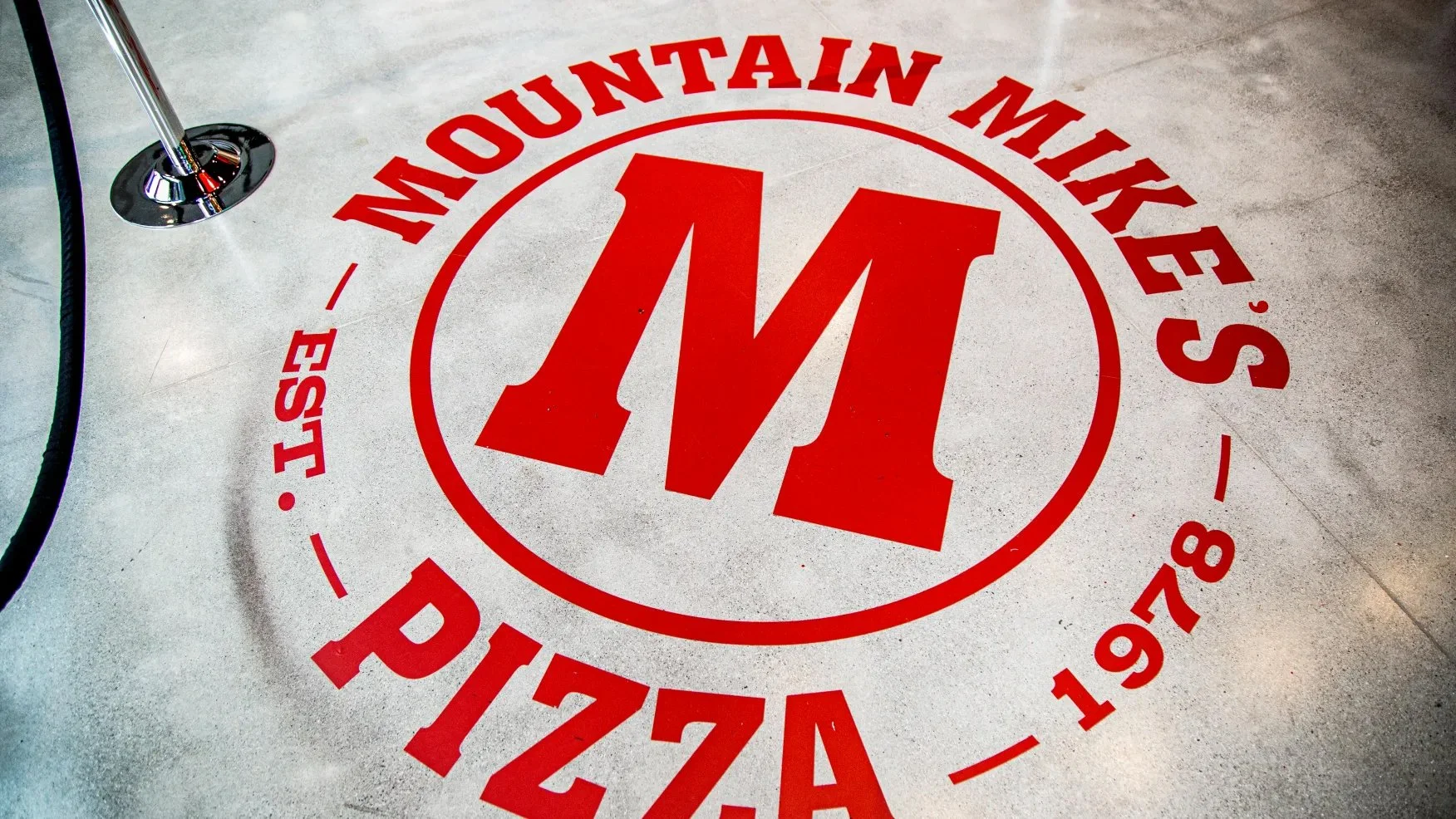
Consistency Across Every Environment
We built the logo system to be flexible and practical across multiple environments and applications. From floor graphics to window treatments to exterior signage, the system was designed to adapt without losing clarity or impact. A big part of the thinking was giving franchisees room to work within different building conditions, allowing the logo to live comfortably in a variety of placements while still feeling consistent. From an art direction standpoint, it was about creating a system that feels intentional, easy to implement, and strong enough to hold its own no matter the surface or scale.

The Result
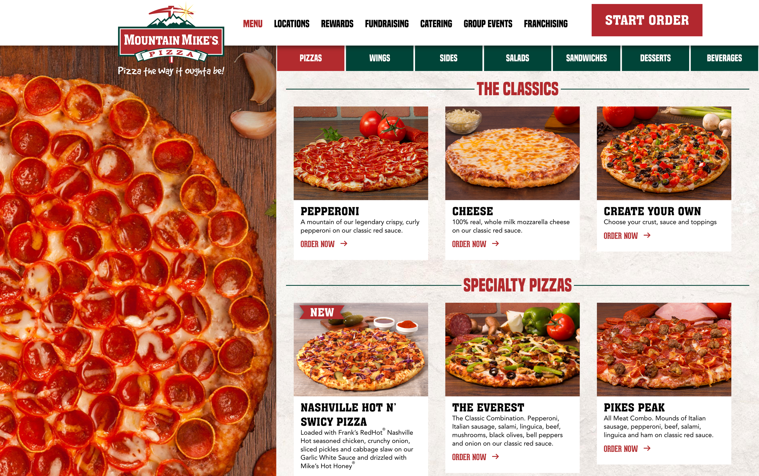
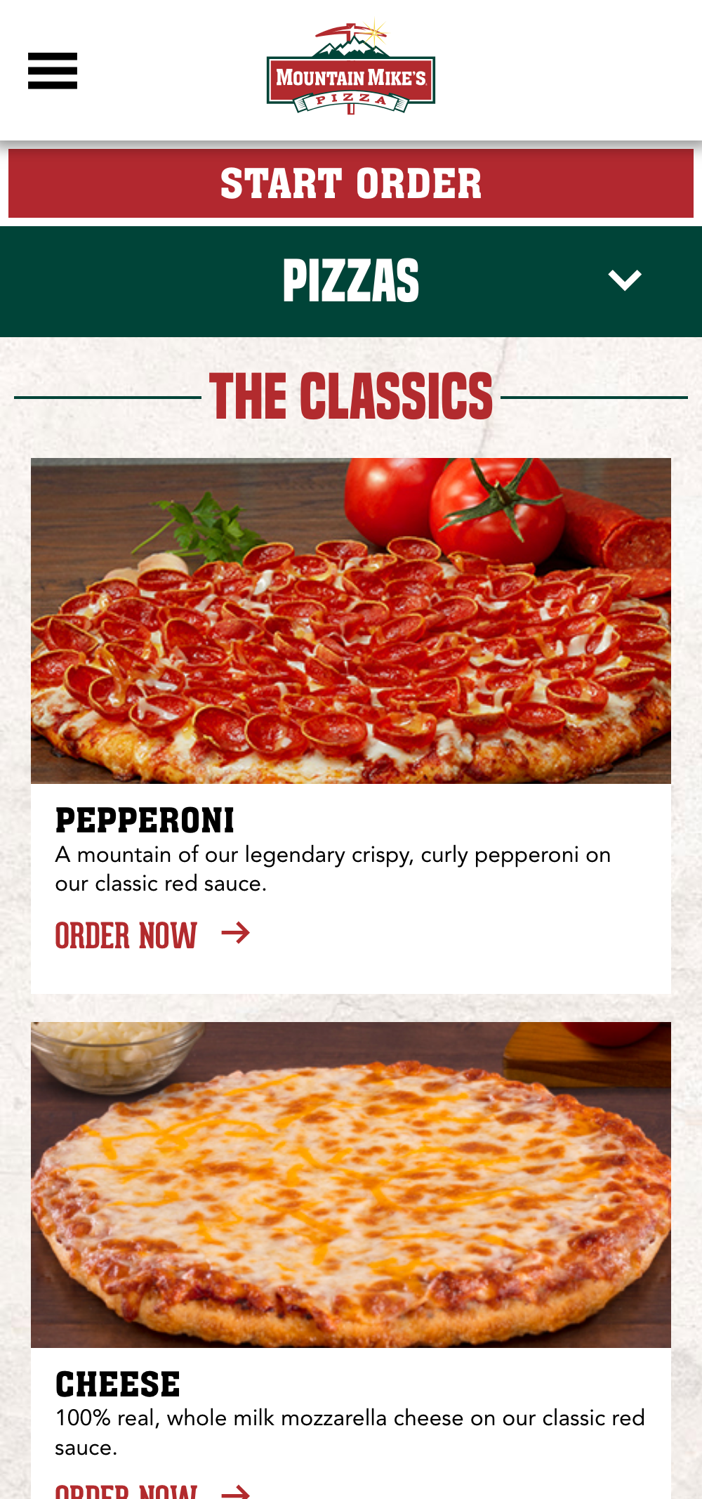
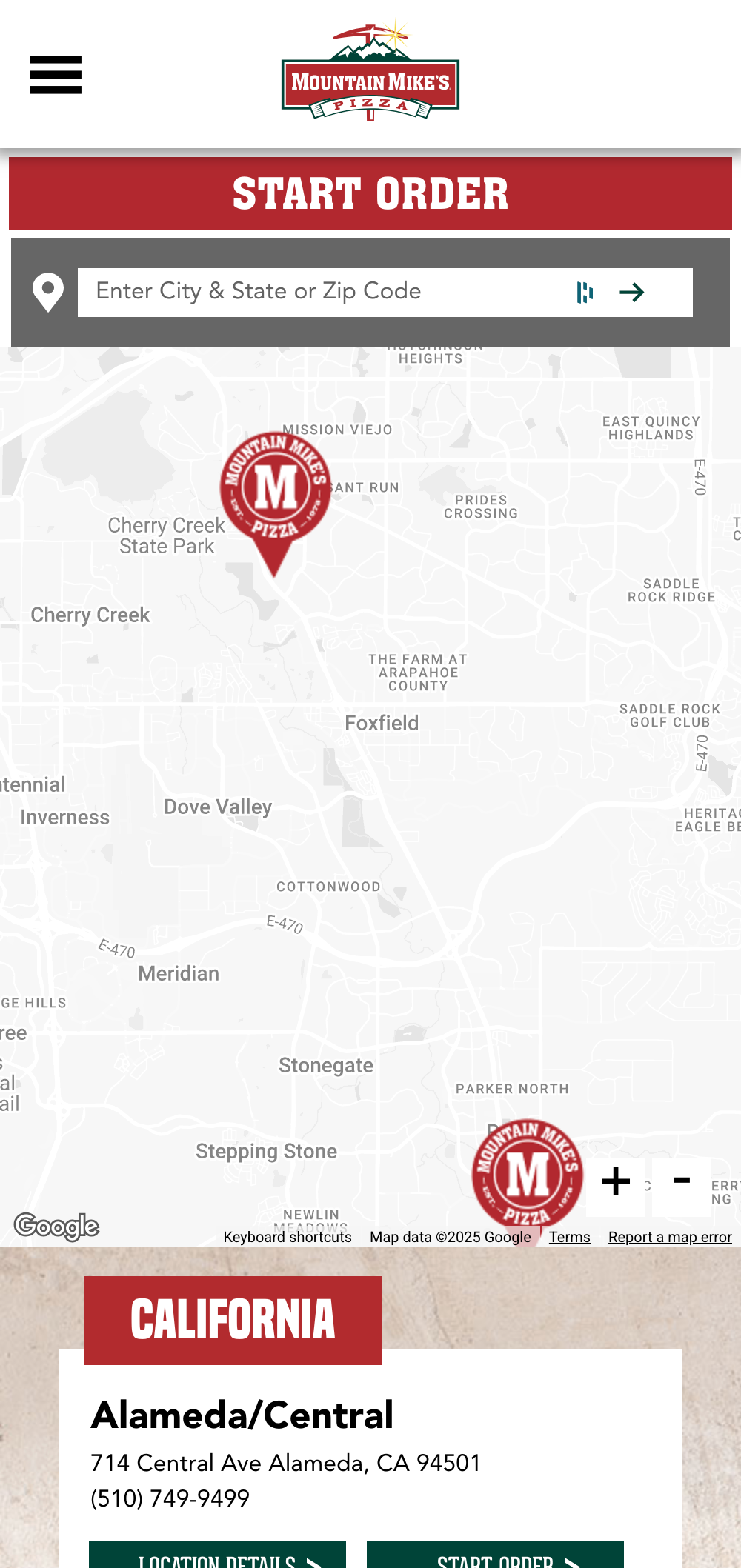
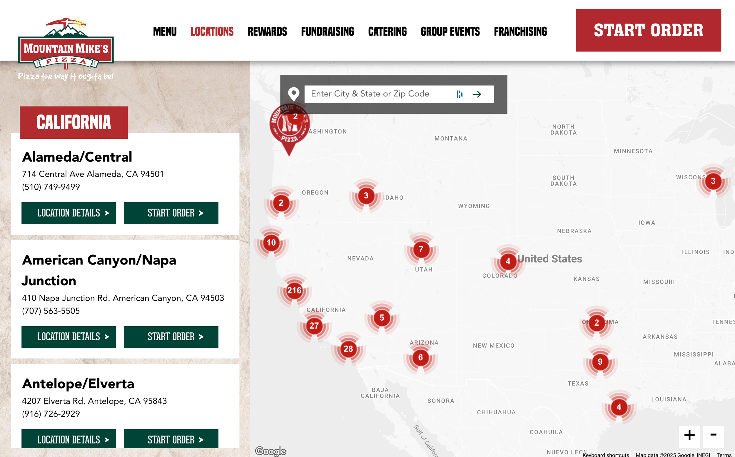
The refresh came together across every touchpoint. A new website set the tone, paired with an updated brand system that feels clean, confident, and current. Fresh photography and supporting collateral helped bring the brand to life, while media ads and social assets extended the look and feel into the world. The result is a cohesive, upbeat brand presence that feels energized, unified, and ready for what’s next.
Case Studies
Hospitality
Retail · Wellness