Rooted Objects
Brand Identity · Website · UI/UX Design
Creative Direction
Brand Identity
Print + Collateral
Website + UI/UX Design
AI Photography Direction
Rooted Objects is a shop for found pottery and garden pieces from Oaxaca and beyond, the object side of Leon’s Landscaping in the Coachella Valley. I built an identity from one drawn idea, a braid, and then held it back so the objects could lead.
Brand Identity
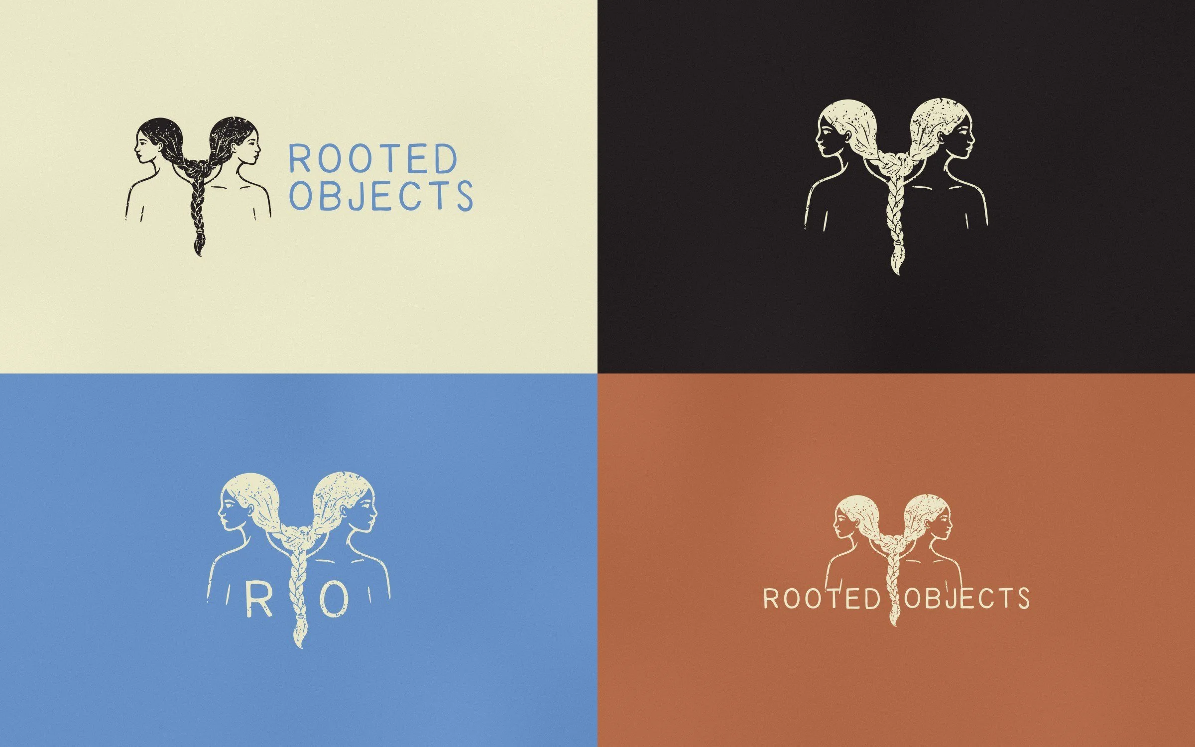
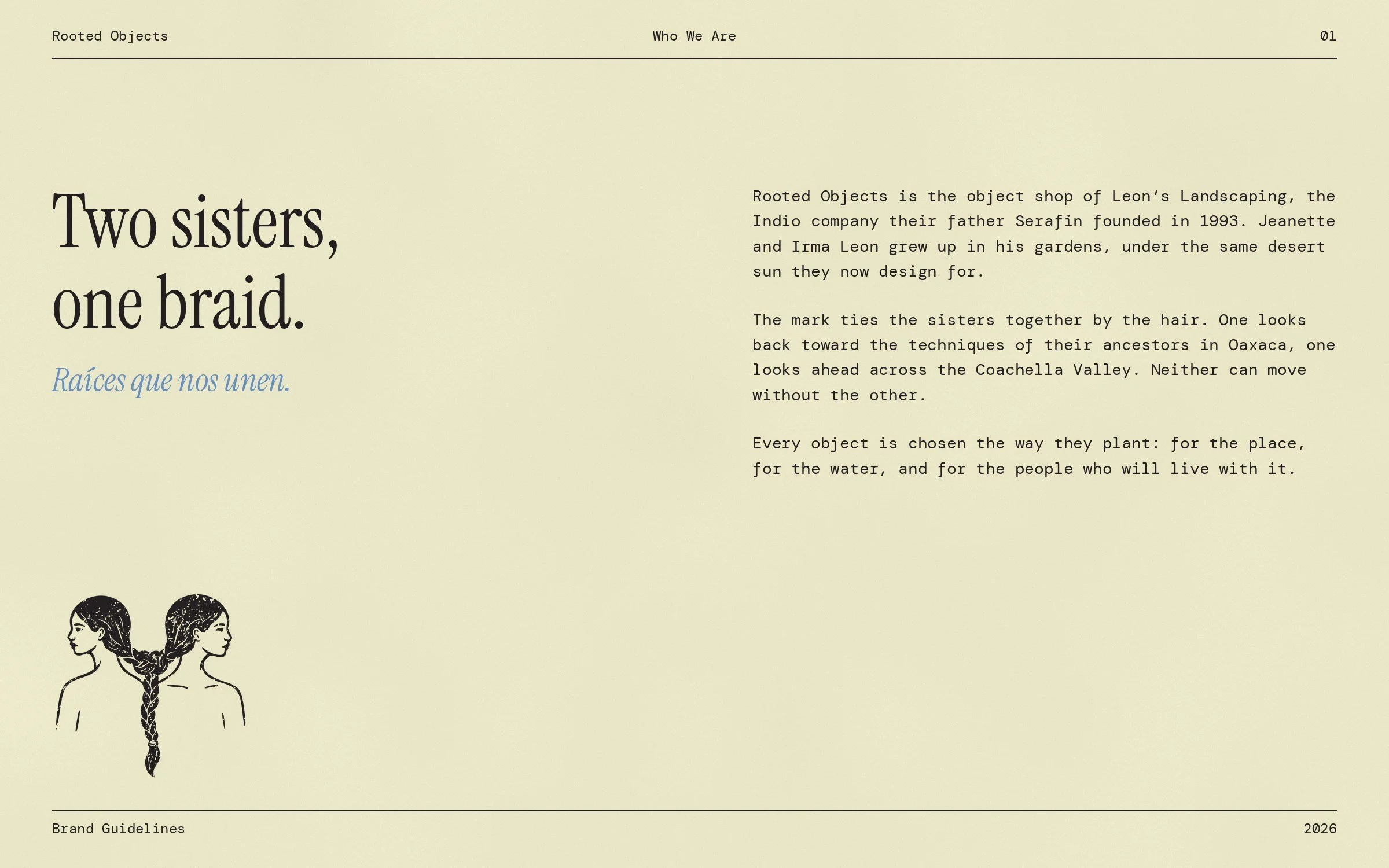
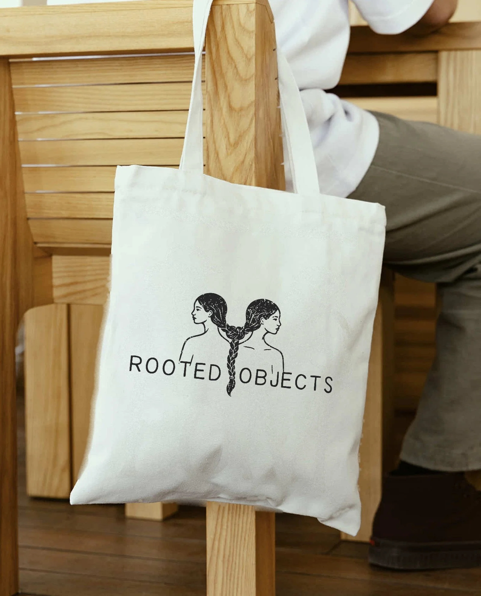
The brief was a shop for one-of-one objects run by two sisters. I started with the braid in Oaxacan tradition, where hair is plaited to hold lineage and identity, and drew two figures tied at the hair: one faces back toward inherited craft, one faces forward. Early sketches leaned decorative. I cut until the knot itself told the story, then pushed the linework toward relief printmaking so it would carry the hand of the objects.
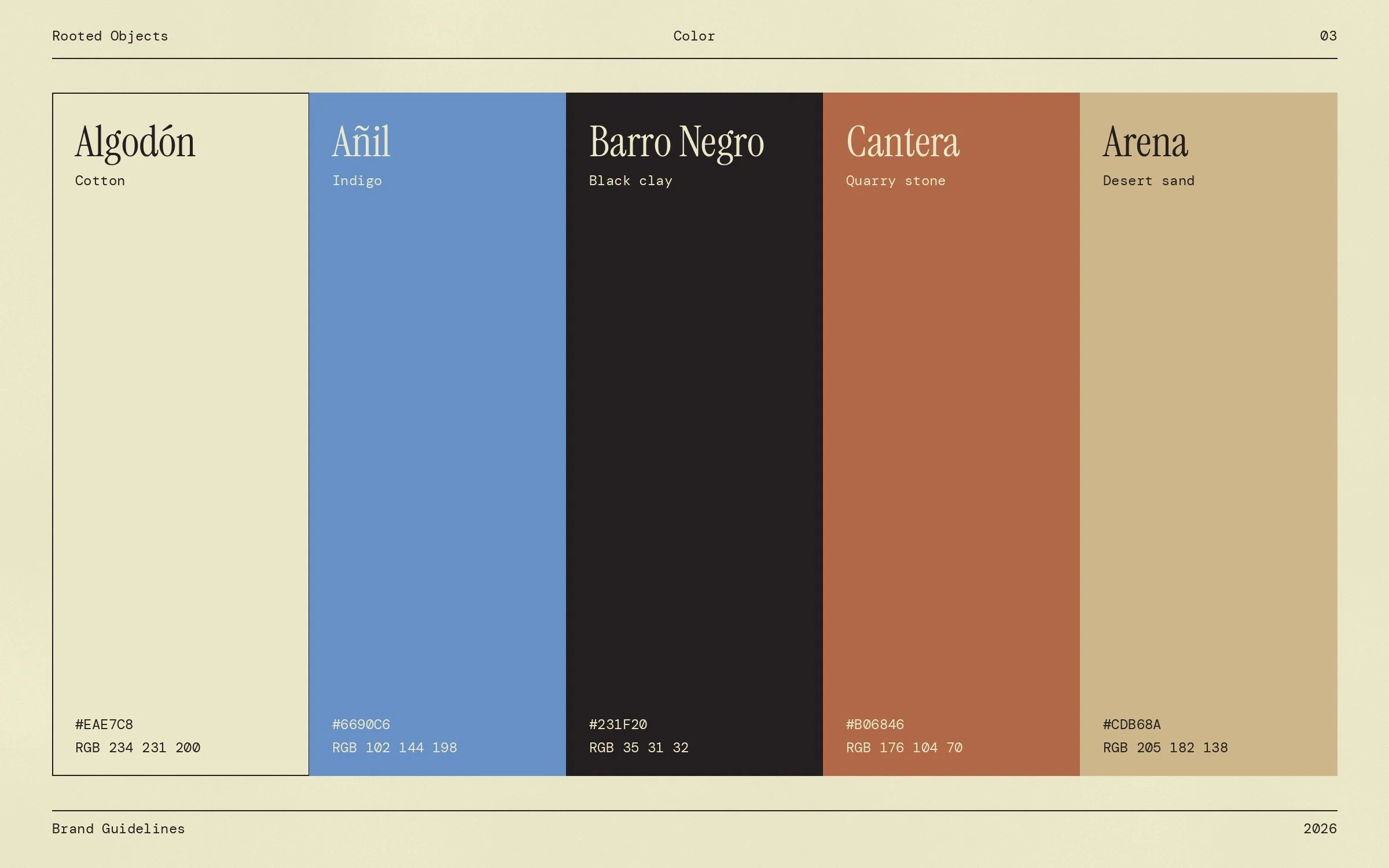
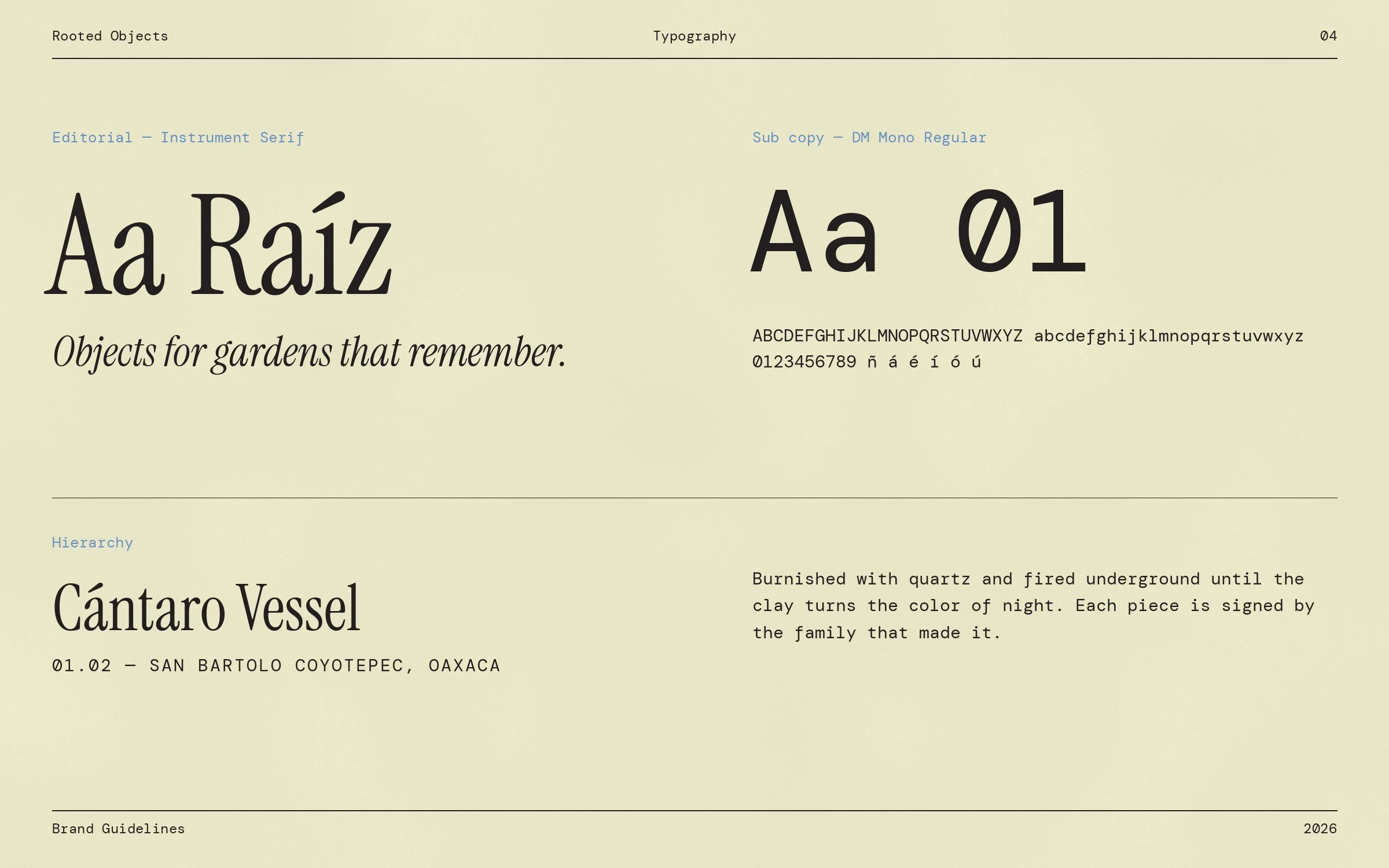
Because the illustration is loud, everything around it is quiet. A monospaced wordmark gives the system the feel of an inventory ledger rather than a boutique, and a single editorial serif handles numbers and names. The palette is pulled from materials, not trends: algodón, añil, barro negro, cantera, and arena.
Website Design
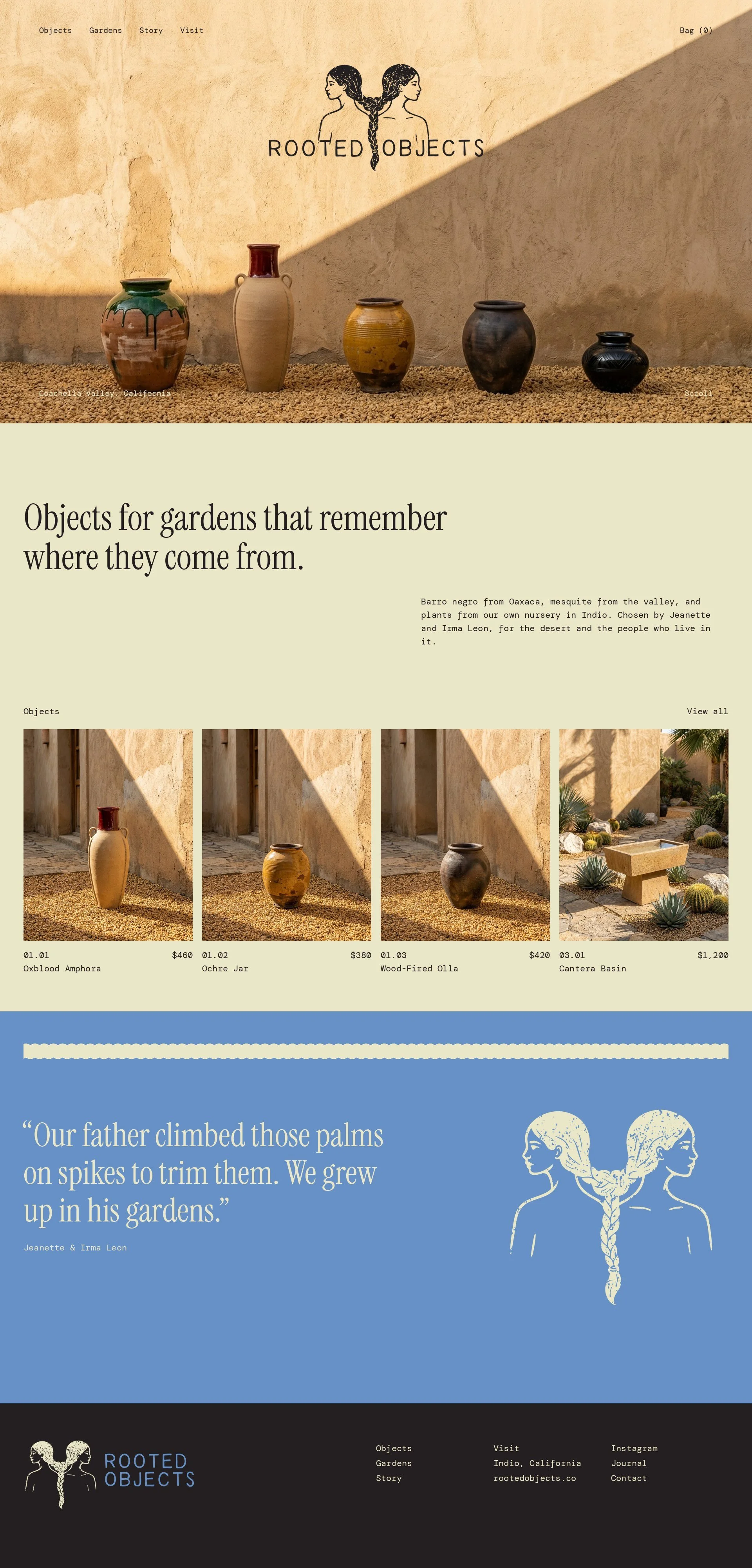
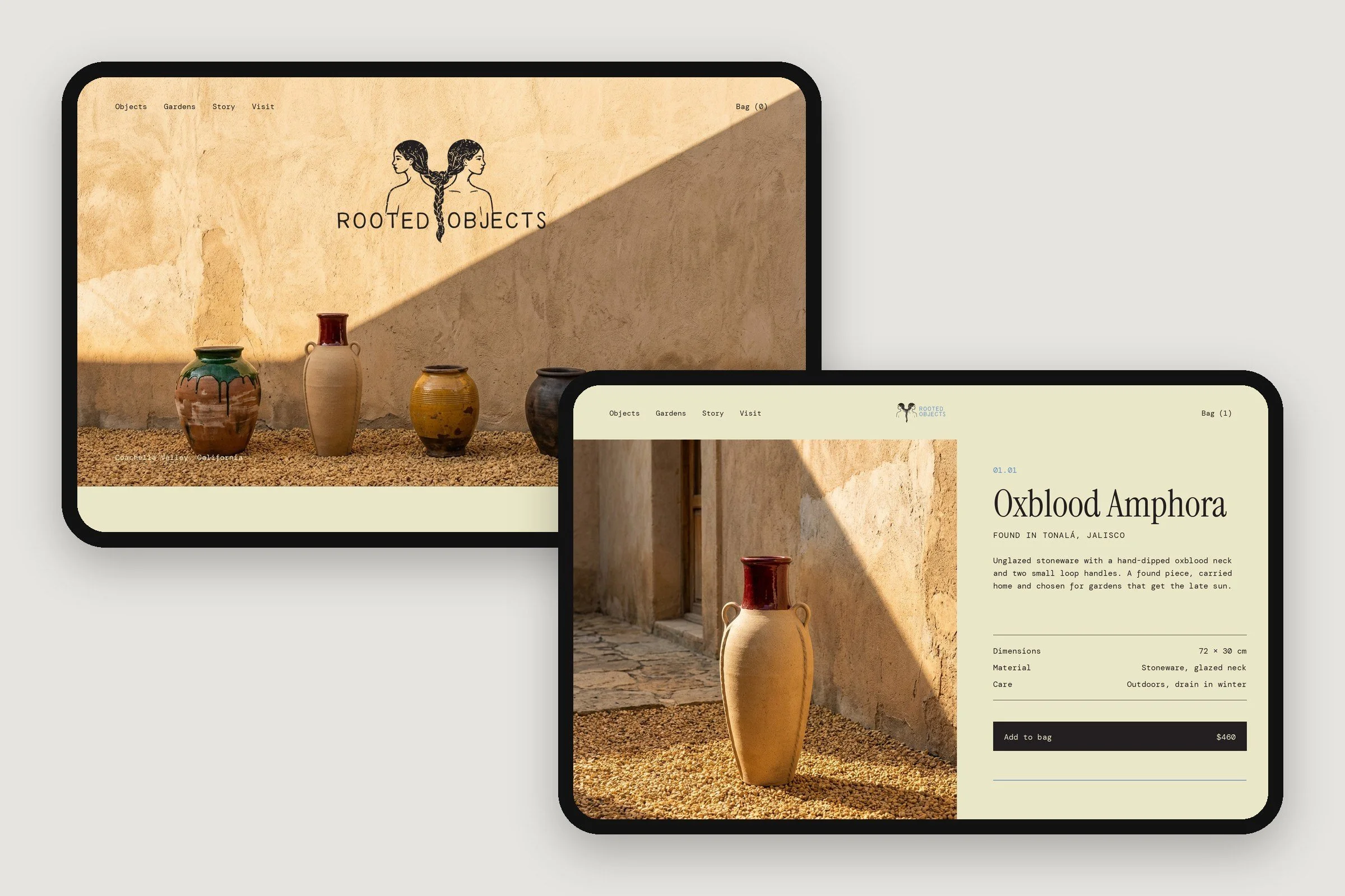
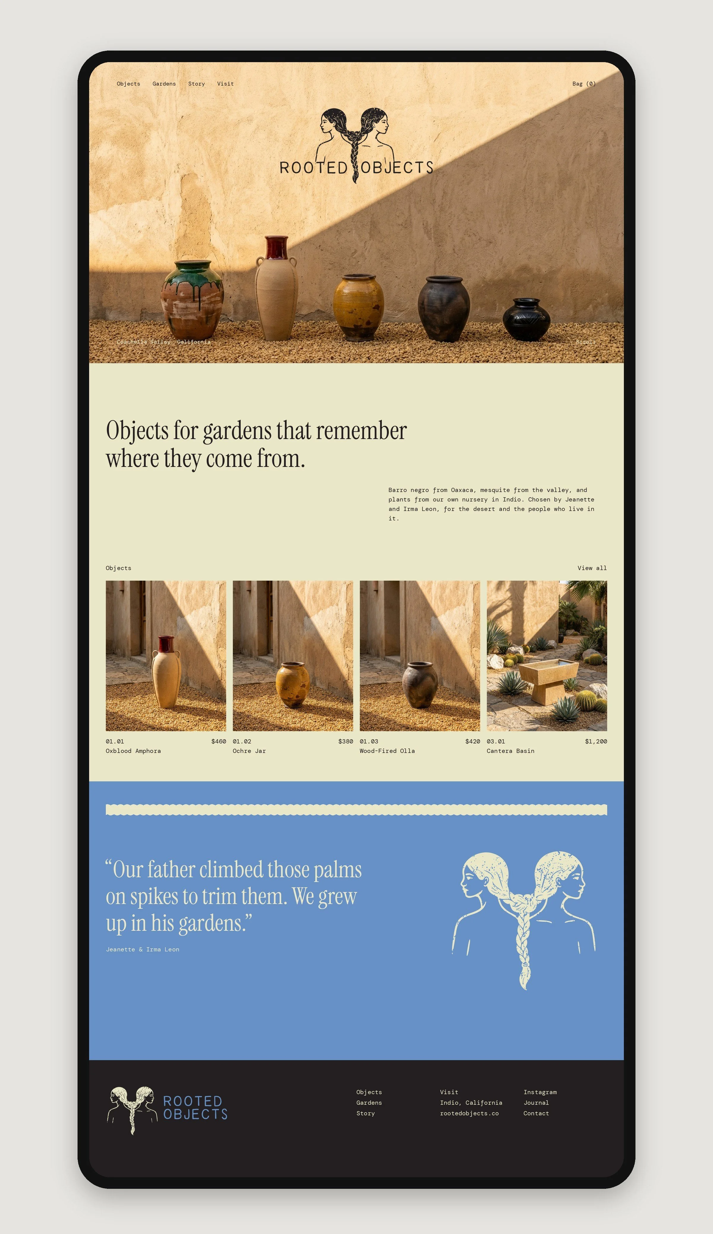
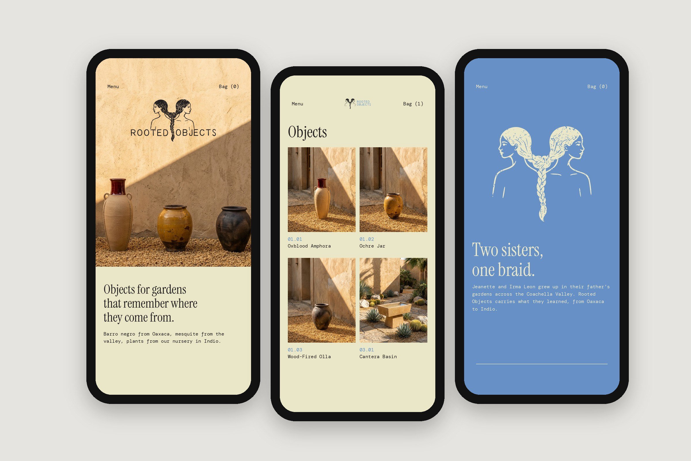
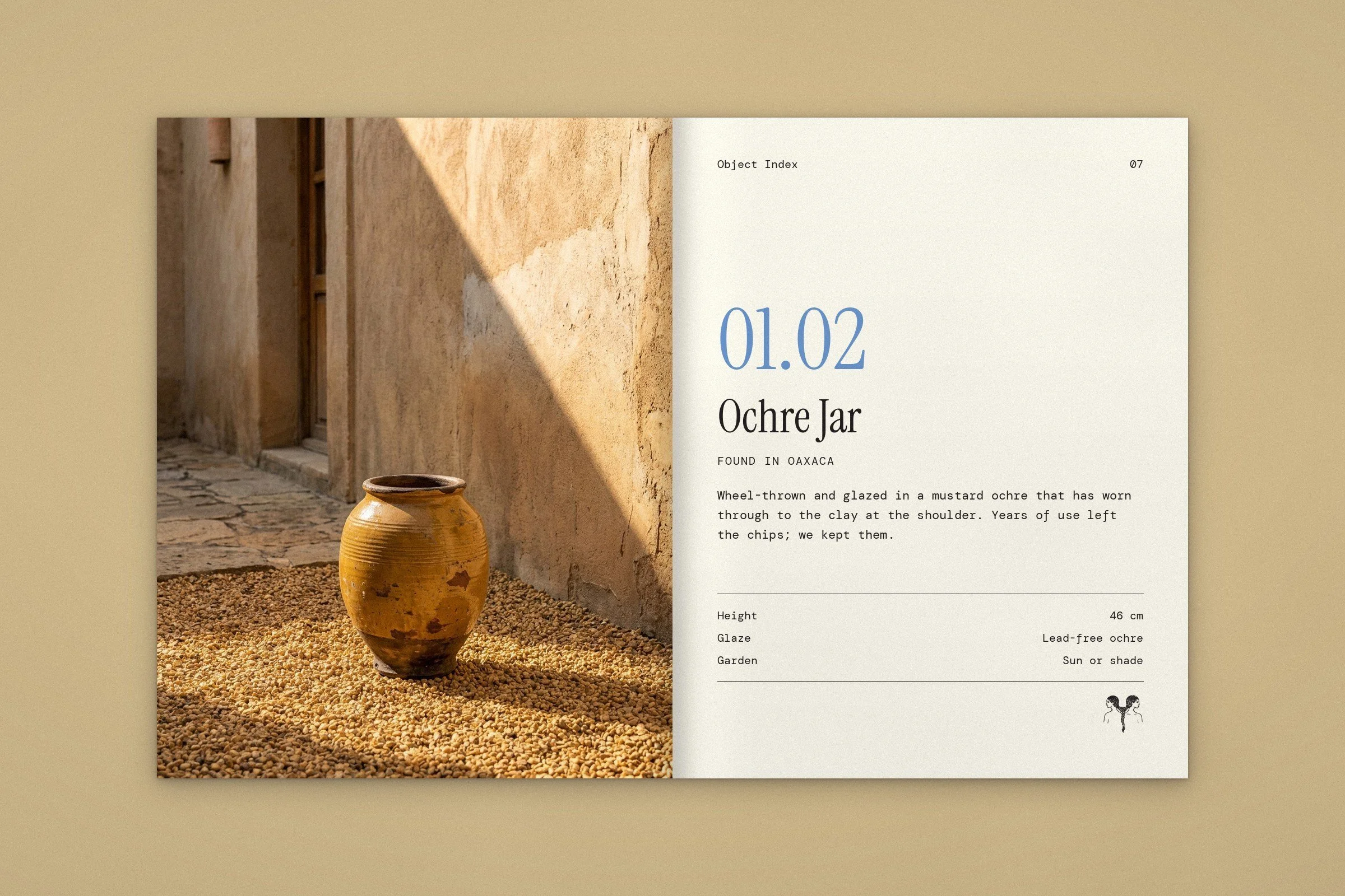
I designed the site like a catalog, not a store. Each piece gets an inventory number, a place of origin, and a sentence about how it was made, because with one-of-one objects the provenance is the product. Photography carries the pages and the interface steps aside: thin rules, mono labels, and generous margins.
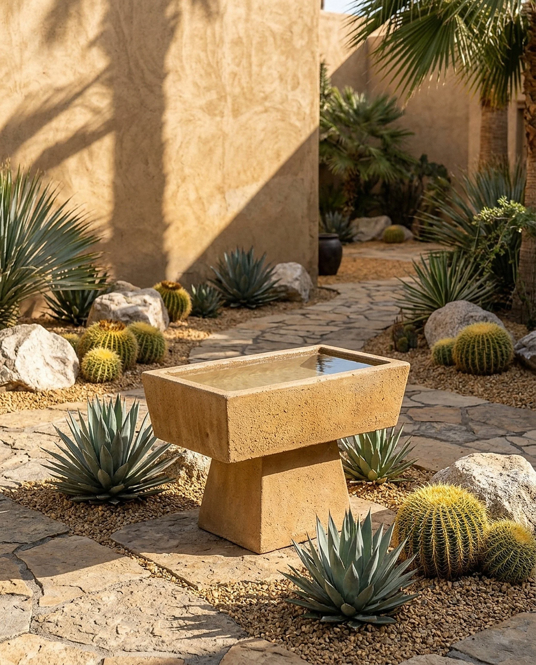
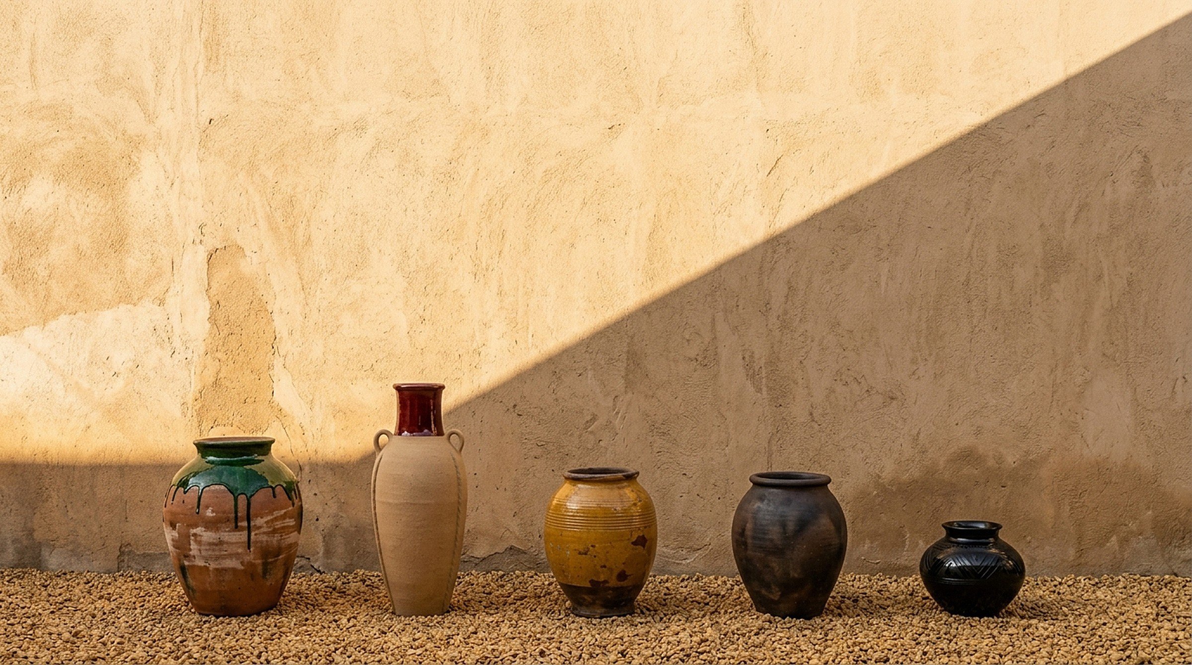
Every object is shot in one setting, a plaster courtyard in hard late sun, so a green Atzompa jar and a cast-stone basin read as one collection. Choosing a single light and backdrop early did more for cohesion than any layout rule.
UI/UX Design
On mobile I kept one decision per screen. The grid drops to two columns so each object still has room to be looked at, type stays large, and the only persistent controls are the menu and the bag.
Social Content
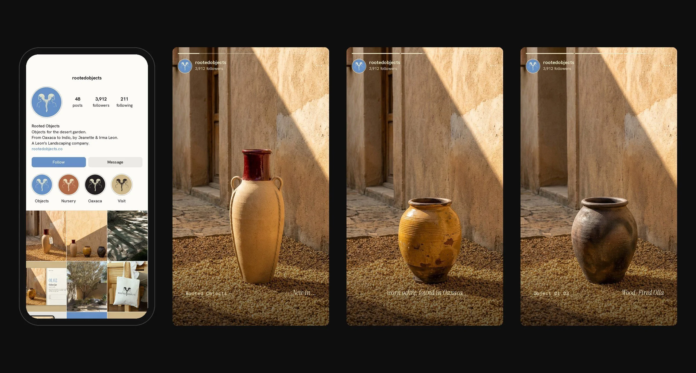
The feed alternates objects with the gardens they belong in, so the account reads as a point of view rather than a product list. Stories follow one template on purpose: a single object, full bleed, and two lines of type.
Brand Collateral
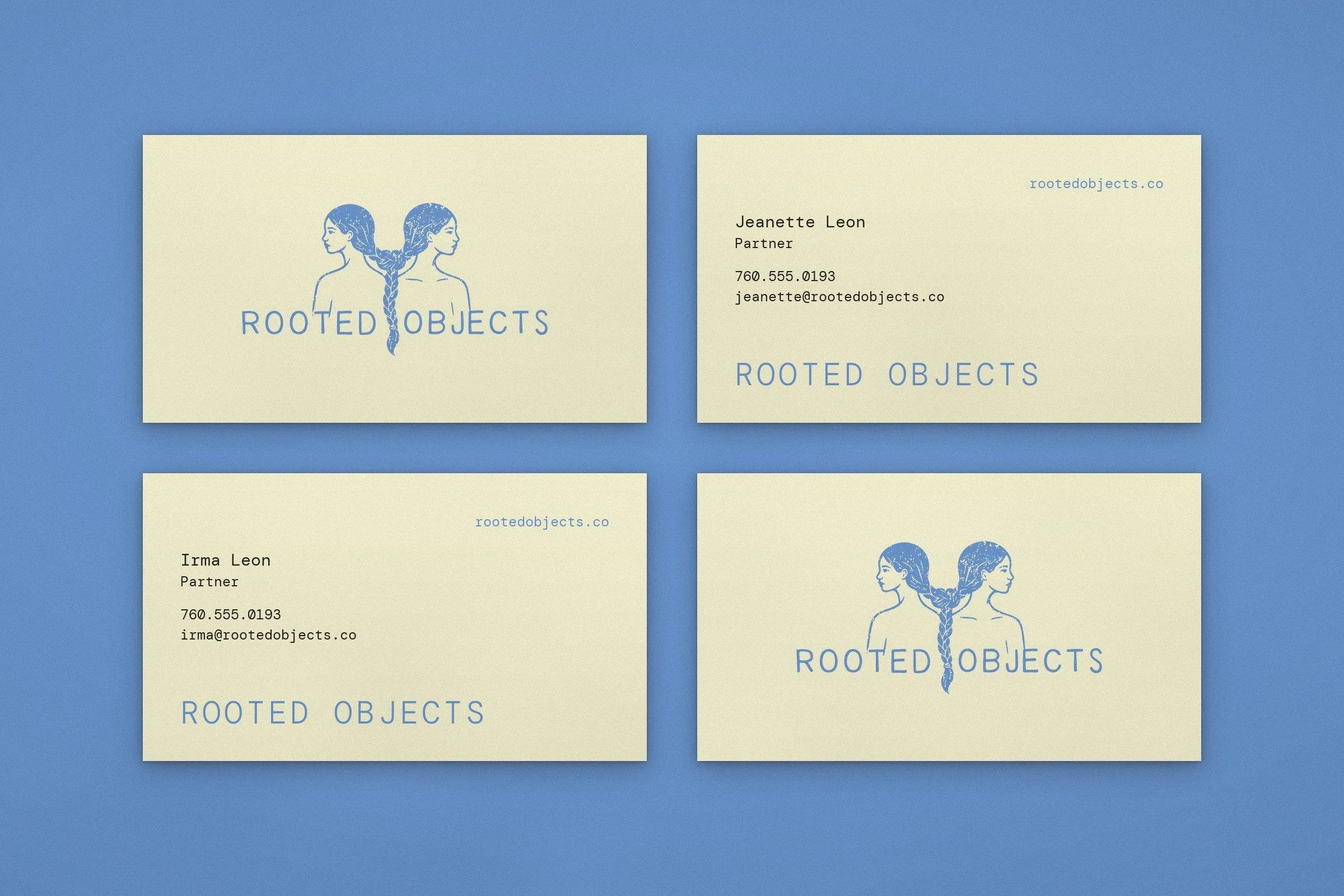
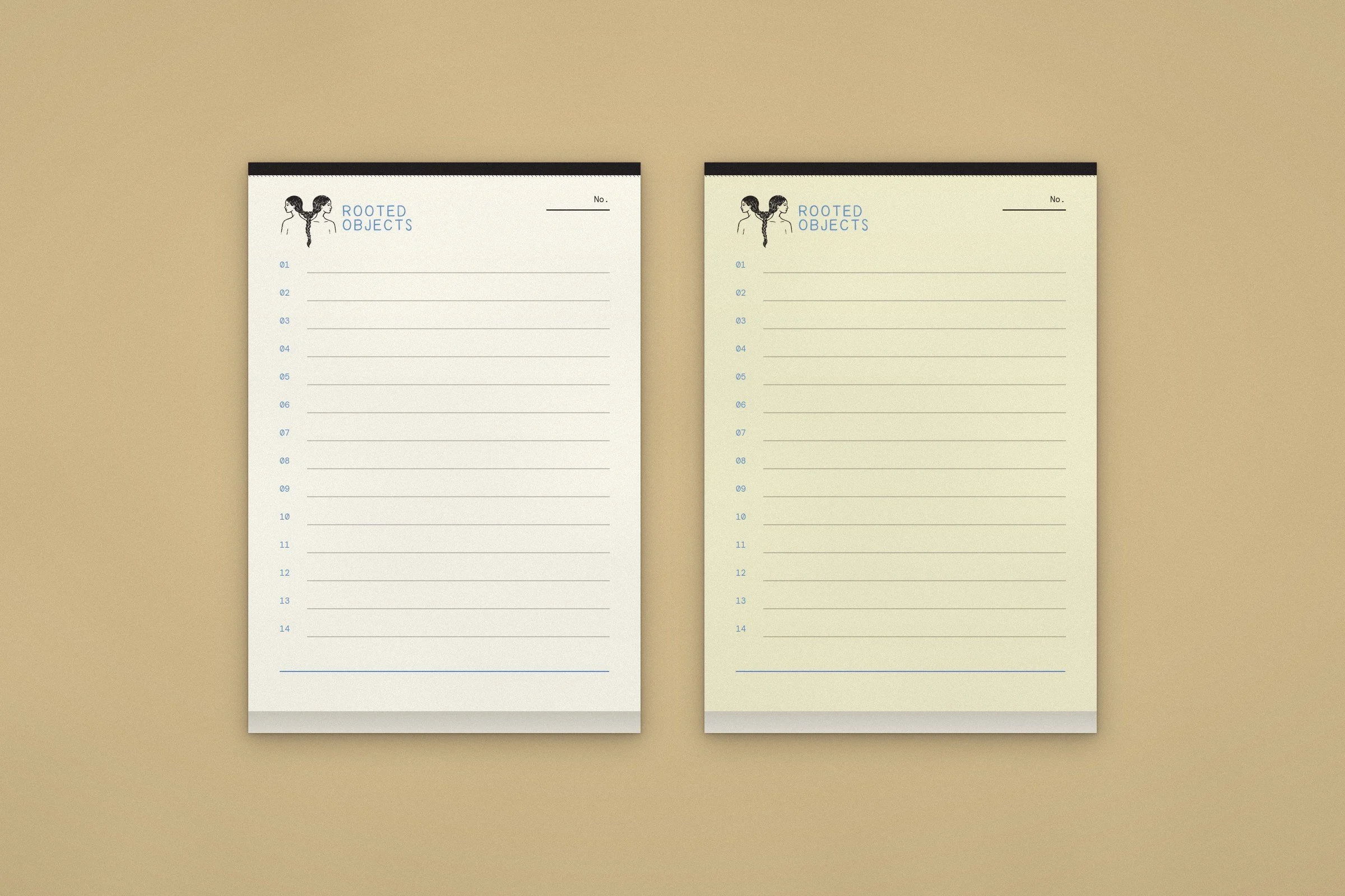
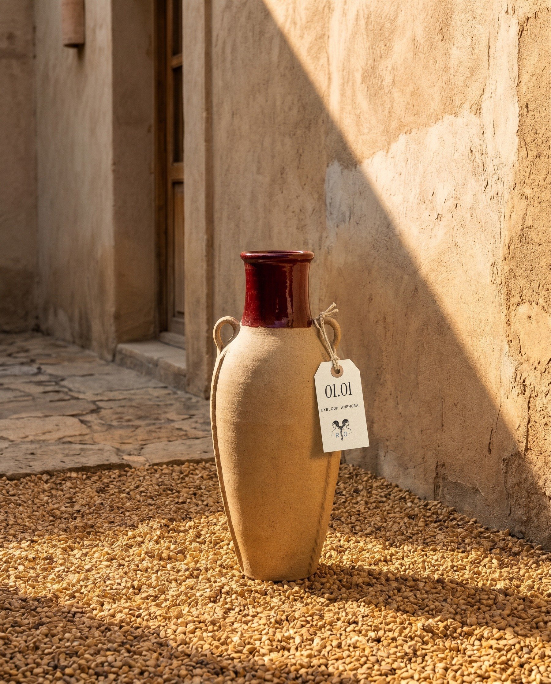
The hang tag came first and set the rules for everything else. Found objects arrive from different places, makers, and centuries, so the tag gives each one the same three things: a number, a name, and an origin. That ledger logic carried into the cards, notepads, and object index.
I tested the print pieces against the objects, not against each other. Anything that competed with a glaze or a clay surface was pulled back: one ink, uncoated cotton stock, and no extra graphics.
The pottery photography is AI-generated. I art directed each piece, from the glaze to the lighting, so the objects read like a commercial studio shoot, then set the real print pieces into the frames.
Case Studies
Hospitality
Retail · Wellness